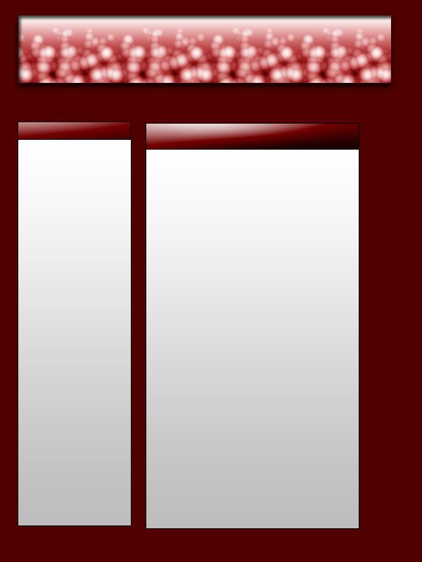
Better than first, although basic and out of shape. Rate my effort.

Results 1 to 10 of 13
Thread: 2nd Layout (proper)
-
 2nd Layout (proper)
-
21-04-2006, 08:28 PM #2
 Habbox God


- Join Date
- May 2005
- Location
- /etc/passwd
- Posts
- 19,110
- Tokens
- 1,139
-

Thanks! I used a tutorial for practise! Thank you for good view!
-

No offence even im not that crap 0.0000000000' /10
-

 Good 2nnd layout, maybe align it properly, but its only your 2ns tutorial so well doen
-

Dude
We al started osme where [Last thursday for me] but i got this advice
Its pretty crap atm man you're box'es are not alinged the gradiant looks bad, the header of the content box are not the same size, they need to be, you need them alinged with the banner and you need more boxes
I dont mean to be harsh but its better than me just saying ''its crap'' or ''its good''
Thanks
-Bielby
Family Guy 3
3
Formally : Bielby2000
RSN: Bielby2007
-
 Wahey! Thanks, thats what i think of my other ones, but it is a tutorial one so its not supremo.
 Originally Posted by DMB-Hosting
To Biel: I know, it took me 10 mins as a tutorial and its 1st go at them, but i heed your advice and thank you.Last edited by Klaus5000; 21-04-2006 at 08:37 PM.
-
21-04-2006, 08:41 PM #8
 Habbox God


- Join Date
- May 2005
- Location
- /etc/passwd
- Posts
- 19,110
- Tokens
- 1,139
-
 Erm no offence but **** off
 Originally Posted by DMB-Hosting
-

Gap between the banner and content box's seems a bit over sized, you also need to try and size all the blocks up so they look more intentionatly placed and less a random, and align them to simlar positions. *gives up, is to tired and unable to write cohirnetly right now.. well at least as much as is normal*


 Reply With Quote


