

What do you think?? i like it
Tell me which you prefer :
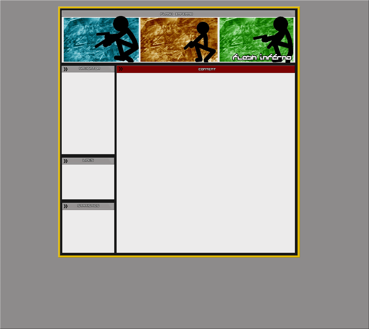
This :
or
Please be honest


Results 1 to 10 of 17
Thread: A new layout
-
 A new layout
Why i've now removed my image because people are "offended.... whatever!
A new layout
Why i've now removed my image because people are "offended.... whatever!

-
They're not what I'd call super layouts but I'd choose the first one mate.
-
The first one looks good =]
-
ye im not the best at making layouts but id prefer using my own the taking someone elses
Why i've now removed my image because people are "offended.... whatever!
-
13-04-2006, 11:23 AM #5JoeComins Guest
I wouldnt choose either.
The top one has so many errors
The bottom one is way too green and has too many errors./
Dont over use scan lines either
-
joe cant you give anyone compliments instead of critiscing them all

-
Honest feedback?
 Originally Posted by Dude2892
Matt lurvs Jay
-
The first one stands out more.
-
13-04-2006, 04:13 PM #9JoeComins Guest
No, I cant. Originally Posted by Dude2892
My feedback is harsh, but to make a layout and be sucessful, you need to have people who are jerks - such as me - who you theng et to hate, which makes that person vindictive, so then goes back and makes a new layout without the points ive given, and thus improving.
By someone saying '' 6/10 - Thats good for a 363748th attempt. Maybe improve on teh borders pls.'' for example, it doesnt say anything. Improve on the borders - How. It dsoesnt say
In my post, I said - Dont overuse scan lines, and the pixel erros, and not aligning things is a major downfall. But just aligning things, the layouts look more professionalm, and makes it look cleaner, and like you have spent more time on it, so anyone who doesnt like this, ie Dan, Dude2892, and proberly half of this forum, you can jump off a bridge for all I care. This is me, and if you dont give 2 ****s, as Dan said, then dont moan to me about it, idiots.
I also dont appreciate being spoken to like Dan just has. If you dont give 2 ****s Dan, shut your ****ing mouth you vindictive, spiteful like man. And if Sygon is such a mate of yours Dan, then why did he say the other day that you were a sh*t coder? Pretty sure it was him. Ill check my logs now
-
Humm i like the banner on the second one, althogh id prefer it if it were a sharper image, althogh i perfer the actal layout of the second one, possible becuse of the sharper, brigter colours which cause it to stand out more, Its less monotone that the green second if you know what i mean "/
The stick men look good, althogh i dont realy think they compose a banner as well as other graphics may, possibly encorpateing them in some other way would be an imrpovement "/
Also sizeing the bar at the top of the content on first bit to the same hiegh as the bars of the left would give it a more simetrical feel, which would also be an imrpovment.
Currenly there not anything specal but they do have potenatl with a little work "/
- i was direct linked in to the codeing forum, even thogh i removed it on the main nav. Danm you Dan! delite this post please, as this forum is a load of **** -Last edited by Mentor; 13-04-2006 at 04:28 PM.


 Reply With Quote


 Posting Permissions
- You may not post new threads
- You may not post replies
- You may not post attachments
- You may not edit your posts