


Hey guys,
I have created a few Habbo layouts before and sold for a couple of pounds / HCs but this time I wanted to go bigger. I posted a draft copy on other forums and they told me how to improve it so here is the "2nd draft" if you like.
Can I have some C&C please and if you are going to be negetive, then give me some ways of how to improve it instead of posting "it's ugly" or "I don't like it".
[img]http://www.****************/uploads/a578bbab15.gif[/img]
Thanks a bunch,
Adam.
Results 1 to 10 of 30
-
 My 1st real attempt at a Habbo layout
Resigned from Habbox.
My 1st real attempt at a Habbo layout
Resigned from Habbox.
 Originally Posted by Misawa
-
I dont like the layout much as its very different, a bit messy. (i dont like different
 ), the buttons are great! I love them
But its fantastic for a first
+repLast edited by Wizzdom; 30-08-2006 at 10:24 AM.
-
So what can I do to improve it further? Keep the buttons obviously
Resigned from Habbox.
Originally Posted by Misawa
-
Hey, I like the nav buttons, but I don't like the colours used. They don't match too well. Also, everything is jumbled up, which is messy. And now I'm really being mean
 (), but some of the boxes aren't spaced out evenly and theres a pixel error on one.
But it is good for a first habbo layout! Get lots of criticism, that way you can do even better in your next!
-
Thanks,
I will get to work on re-spacing the boxes now and any help on some decent colours would be appreciated. Also, where's the pixel error :p.Resigned from Habbox.
Originally Posted by Misawa
-
Hey Thtere.
Nice try for your first. I would say don't include so many images next time as that im my eyes spoils it abit.And also maybe try and include a pattern or something on those lines as a backround instead of one solid colour as you have.
But its a nice try for your first. +Rep.
-
Maybe a light blue, medium grey and some toned orange? I like them colours dunno if you will!
Good layout work on the things suggested then it should be very good! 
-
Would that work for a Habbo layout? Originally Posted by -Xperience

I will add the background pattern now, might see what the actual Habbo BG looks like with it, or may include some screenies of public rooms etc.. I will post an update once done.
Resigned from Habbox.
Originally Posted by Misawa
-
Look at the habbo homepages. Just yellow/orange content boxes, and if you add a blue background with scanlines or something it would match.
Last edited by -Xperience; 30-08-2006 at 10:42 AM.
-
30-08-2006, 10:44 AM #10
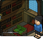
Buttons are nice however I think you are making pictures more important than the layout itself.
Move the pc guy or w/e out and make one of the boxes longer or so.---MAD---

 Reply With Quote


 Posting Permissions
- You may not post new threads
- You may not post replies
- You may not post attachments
- You may not edit your posts