

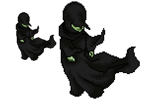
Ellorr, havent done an alt in a while so I thought I'd do this. Was a very quick alt, hope you like it ;D


Results 1 to 10 of 17
Thread: [Wolk] Harry Potter - Dementor.
-
 [Wolk] Harry Potter - Dementor.
-
Ellorr Wolk.
That's good - the shape is perfect. Maybe throw in a divider tone between the dark and medium tones? Too much contrast.
Other then that amazingly good =]
-
its good but the skin tone is green. i thought dementors were more aof a pale colour?
-
To me its just a big cloak, and small bit of face.
Make it more this style that way youcan add mroe detail on it. :]

-
ty for the comments.
and it's extremely hard to get a vary in tones when it's so dark.. D;
-
Yeah as everybody is saying you need to do a bit of shading and colour contrast. It would make it look so good seriously.
-
But not make it exactly like this
 Originally Posted by Hollywood


I like this alteration, but what someone above already says:
there is a little bit too much contrast.
But i repeat, i like it ^.^
-
26-01-2008, 12:30 PM #8

- Join Date
- Nov 2006
- Location
- Shropshire
- Posts
- 1,590
- Tokens
- 357
- Habbo
- MailOffice

Making one layer light i have.. Seems better?
.xo
-
I still think it's too grey instead of black D; Originally Posted by Vicky-Pollard
-
And now there really is WAY too much contrast vicky

I'll never let this thread die!!11!

 Reply With Quote


 Posting Permissions
- You may not post new threads
- You may not post replies
- You may not post attachments
- You may not edit your posts