

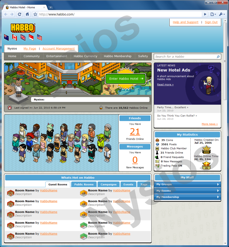
Now that all the English speaking hotels have merged it got me thinking whether Habbo Staff are going to do any improvements to the main website. The current website design has been used since 2007 (I believe) and habbo client updates have made it old and sloppy. For example, in the "my habbo" section on the homepage, the old USA hotel view appears even though the hotel view has been changed for several months. Therefore I have designed a new Habbo homepage, see below for image and walk through.
- The Habbo logo has been slightly updated, incorporating the flags of each hotel which have merged together. (AU, CA, UK, SG, USA)
- The blue banner at the top remains but now has a more graphical feel to it with the colours running from light to dark. The sign out and help tabs remain at the top.
- A user bar appears at the bottom of the blue bar. It includes your Habbo name plus hyper links to your Habbo Home page and your account settings page.
- There are six button tabs. The entertainment section has been brought back. The credits section has been renamed to "Habbo Currency" to stop confusion about the name change now that all hotels have merged (For example, Hotel UK knows them as Credits and American hotels know them as Coins).
- A search bar has been added to search for habbos. Ideally if the Habbo searched exists you would be taken to their Habbo Home page.
- The "My Habbo" section remains and has been made larger. The background image has been changed from the previous hotel view image to the new hotel view image. Other statics such as trade pass, friends online, coins and pixels have been removed from. The last time your logged in appears hear along with the total habbos online, which has been moved to this section.
- The news section returns in its original format. The outline has been changed from grey to blank to match the rest of the layout - apart from that there is no change.
- A new friends management system is introduced. It shows image of all of your friends which are currently online. You will then be allowed to move the images of these habbos inside the blue box - organising them the way you want. This would then save and that habbo would appear in the place you placed their image the next time they sign in. There are two smaller boxes here too which show you the number of friends online and all your unread messages. Clicking the numbers take you to that section of Habbo.com.
- A stats box has been introduced. It includes information about your coins, pixels, membership, friends, requests, mini-mail, trading as well as how long you have been playing Habbo.
- Hot rooms and campaigns have been merged together in one section along with hot public rooms, groups. events and tags. Tabs allow you to switch between them without leaving or reloading the page.
- Finally "My Stuff" has been introduced. This holds information about your groups, rooms and membership (HC and VIP). Tabs hide and show this information.
I think it makes it more simpler and up-to-date without hugly changing the habbo we have all come to love. I would also just like to point out that this was made with graphic software and I just added the Google Chrome browser to the image - so this is not a working prototype - just an image. I also added "Nysios" across it to stop people from stealing it or trying to make it into a fansite layout.
What do you think?
Results 1 to 10 of 17
Thread: New Habbo Homepage Alt
-
 New Habbo Homepage Alt
-
23-06-2010, 09:49 PM #2
That is actually a pretty cool layout however I think the box with the habbos and the box with the rooms should switch.
-
24-06-2010, 07:16 AM #3
Really good
 I like the habbo created bit being on the homepage
-
WOW. I would love this.
 33
r.i.p.
33
r.i.p.
-
24-06-2010, 08:45 AM #5

i like it but theres something to it that is bringing it down a bit but im not sure what
DJ Porky
2006-2015Habtips - Habbolot - Habbox - Habbed - HHGS
-
24-06-2010, 03:24 PM #6
-
24-06-2010, 03:35 PM #7
- Join Date
- Jan 2010
- Location
- Chicago
- Posts
- 383
- Tokens
- 0
- Habbo
- .:truthstar
looks amazing love the friend thing could be used for a retro


-
Wow, thats great, I love the 'friends' idea. Well done!

I'll be branded a maniac for speakin' the truth and I'll be murdered as soon as I hit the streets with the proof.
-
24-06-2010, 10:41 PM #9

Proof its yours please.
It looks like it could be from a retro.
-
Are you serious?
 Originally Posted by Wilkd

How am I meant to prove its mine - besides the fact that its got my Habbo name all over it as well as the name incorporated into the design. Here's a picture of it in Fireworks on my computer if you feel that is adequate proof - however if you feel that you need to be the only one to question its authenticity and my design skills, then go ahead. However here are a few things you should take notice of.
1. Its got the exact same news headlines at Habbo on 23-06-2010. A retro wouldnt do that
2. I highly doubt then thousand people would be playing a retro.
3. Habbo created on Jul 25 2006?
4. As you are a pixel artist, you would notice that you can see where I copied the outline border of Google Chrome on the right to make the frame bigger to fit the layout.
:]Last edited by Nysios; 25-06-2010 at 01:37 PM.

 Reply With Quote


 Posting Permissions
- You may not post new threads
- You may not post replies
- You may not post attachments
- You may not edit your posts