


CAN SOMEBODY MENTION NOTSackRace & EXPLAIN HOW TO MENTION PEOPLE?

Results 1 to 10 of 16
Thread: Enlargement for NOTSackRace
-
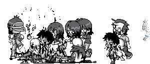
 Enlargement for NOTSackRace

-
-
21-01-2013, 04:35 PM #3
 It's a zero not an O, @N0TSackRace;
 Originally Posted by David

It's not bad, love the detail on the shirt and all of it really. Not too fond of the glasses though .
.

-
2 quick for u sorry ;l Originally Posted by Samanfa
hi give it red hair
-
notsackrace asked me to do that and its an black-haired habbo

++ thanks to u all
-
21-01-2013, 06:20 PM #6
One thing that I would say is that there are loads of unused colours which are unnecessary as you can barely see them. It also seems in some places you are just placing random lines without actually thinking about it in an attempt to add detail, but to me it just looks quite sloppy & I'd advise to be more precise as it's something I used to do and being more precise just improves the end result dramatically. One more thing regarding shading is that the flower shirt seems more shaded as if they were objects themselves, not a shirt (though the actual design may be like that, I don't know for sure). Finally, you should probably work on the hair's line art, it's all circular and weird when it should be spikey and adding lines which mimic hair can make it appear more fleshed out.
-
-
21-01-2013, 07:28 PM #8

That is absolutely amazing.
Damn, any chance you can do one of my current avatar?

-
21-01-2013, 09:05 PM #9
- Join Date
- Jun 2011
- Location
- Lisbon / Edinburgh
- Posts
- 5,651
- Tokens
- 17,995
- Habbo
- LiquidLuck.
I quite like it and better than I could ever do, so good job!

-
i really like it
i used to put the names of my favourite singers here... then i realised nobody cared

 Reply With Quote


 Posting Permissions
- You may not post new threads
- You may not post replies
- You may not post attachments
- You may not edit your posts