

It's not very good. Give rating out of 10 please. COmments about improving it would help. Thanks.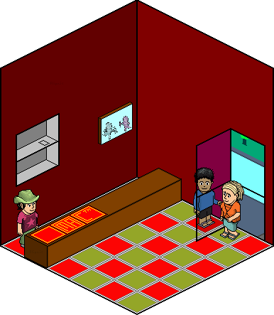


Results 1 to 10 of 14
Thread: McDonalds
-
 McDonalds
-
I think the door is not so good. The flooring yellow is a bit too green. The habbo behind the door isn't affected by glass, and no glass is perfectly clear
 . The picture is not so good. The person behind it should have some way of getting in.
...but overall well done.
-
20-03-2006, 02:03 PM #3
the door and the outside area needs more detail and better color combination
I think u should actually include the m logo in it as well..
the cupid too pixelated and unclear include more details like ppl queueing up or cashier? dont make it too habbo based..Please visit my websites (yn)
http://ks3sci.webs.com/ to revise Key stage 3 Science
http://igcsechem.webs.com/ to revise I/GCSE Chemistry
http://plain_indians.webs.com to learn about the plain indians
http://medic4u.webs.com for first year medical notes
http://medics4u.webs.com for second year medical notes
http://catchetat.blogspot.co.uk/ to check out my blog (as a boring medical student)
-
The floor is a horrible colour, maybe choose a like lighter red, the stuff on the desk where the man is working isn't good and needs some work. Overall I think it needs alot of work and needs to be improved. 5/10


-
...
Look OK...
But i would really know that it was McDonalds...Just not much on there to show what it was....
But it good anyway...
-
If i walked into that i'd properly think it was oxfam.
2/10
-
search my name i dun a mc donalds but i dont really like urs

-
It's coming along.. Roof is too high IMO, floor is a good effect but I dislike the colours. The glass should fade what is behind it, and should be reflected.
Other than that, good effort. ^_^
-
-
Put some spots on the worker. Nearly always spotty teenagers!
 Originally Posted by flipnic

 Reply With Quote


 Posting Permissions
- You may not post new threads
- You may not post replies
- You may not post attachments
- You may not edit your posts