


I made this earlier this year, and didn't bother posting it. So now i'm posting it. Im not really finished, but I guess it looks okay. Comment and rate
Results 1 to 10 of 25
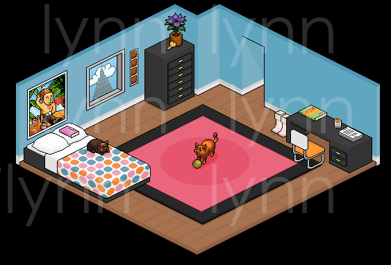
Thread: A Bedroom
-
 A Bedroom

-

Wow, that's ace. I can't spot any errors, but yet, I'm not a great pixelist. Good job, out of ten I'd give it... a ten!

+Rep.
-
-
On the wardrobe and the desk, the top of it, where it shades into a different colour, it just looks odd to me, like theres no connection between the two surfaces, probably because theres no...
[Shows using a picture]
Mine with the new added lines on the wardrobe:
The original:
It sort of shows where an 'edge' is, so to speak... Apart from my stupid criticims. :p It's awesome.
-
-
Its amazing, but the key is too big I think.. lol
9.8/10 + REP
Seph- I think lynn's looks better but If you want your's to look better you should colour the lines in a lighter colour (lighter grey) BittyBay Username: CollectedDate: 11-17-07
 ♫Current Reputation: 101♫Last Reputation from: Whiteman12 -Thanks!-
-
Yeah, I was supposed to change the dresser but I forgot.
Thanks.
-
15-06-2006, 09:08 PM #8
Omg, Those Boots, They Are Shexy! Anyway 9/10!!!
 Edited by Nick (Forum Super Moderator): Please don't have images in your signature that exceed your usergroup.
-
That looks incredible. The bed, the drawers and the desk are really good. 10/10
Last edited by Wayne; 15-06-2006 at 09:10 PM.

-
It's quite good, a little basic, I would have expected you to attempt to put some detail in it, or do you find it embarrasing to make a mistake?
Water marking is a bit extreme... Or does everyone do that nowadays... o.O??Last edited by Roboevil; 15-06-2006 at 09:44 PM.


 Reply With Quote


 Posting Permissions
- You may not post new threads
- You may not post replies
- You may not post attachments
- You may not edit your posts