


Program Used: PhotoShop CS2
Date Created: 12/10/06
Please Rate out of 10 and all comments are welcome
[IMG]http://www.****************/uploads/64a4433bc5.png[/IMG]


Results 1 to 9 of 9
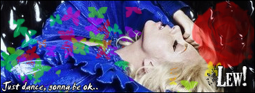
Thread: Light Blue Layout
-
 Light Blue Layout
-
Personally, i dont like it. I can see you have tried to go with that Button look everyone is using now. And it doesnt look right. Too much Brightness + darkness. Try making the colours more closer together or use a gradiant.
Also the Logo, Its TOO Blurred, It would look good a bit blurred but its too blurred. Same with edges of layout. Try using a more noticable font. And make everythink lighter.
On my screen, Its Dark blue. Very dark and Horrible.
If you have any queries or questions, just PM me!
:eusa_thin
-
I Like it, But you overdone the size of the boxes, 8/10 +REP
-
13-10-2006, 07:27 AM #4
it blends together tooo much - and its depressing. but! good innovation on the logo - just brighten up a bit
-
thats total crap no offence dude
-
ok to much blending
Last edited by SimplyTech; 13-10-2006 at 07:36 AM.
-
yep agreed.
-
Its not really light blue either is it
-
more grey


 Reply With Quote


 Posting Permissions
- You may not post new threads
- You may not post replies
- You may not post attachments
- You may not edit your posts