


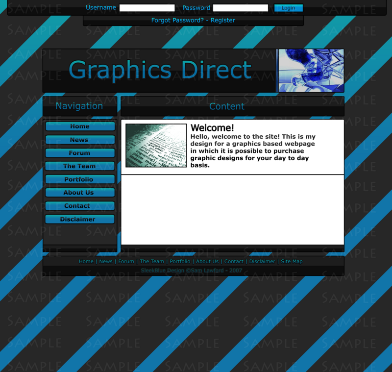
Developed it a bit more - Didn't want to bump the old thread.
Click


Results 1 to 10 of 22
Thread: Graphics Direct -
-
 Graphics Direct -
PM me for help.
Graphics Direct -
PM me for help.

-
18-11-2007, 12:56 PM #2
I've said it in the other thread but you were probably busy
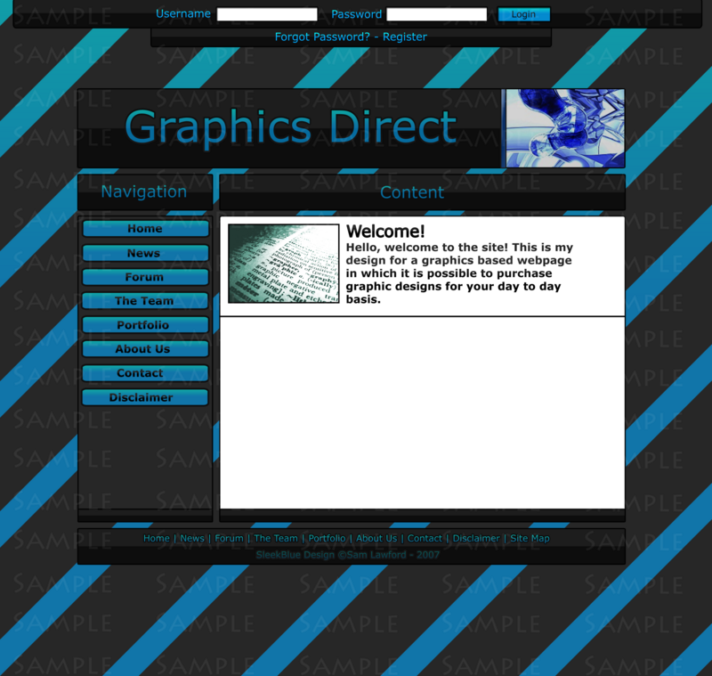
 , I think it looks to small, the content box. Seems so squashed...
Ex-janitor. Might pop in from time to time, otherwise you can grab all my information from http://jamesy.me.uk/
, I think it looks to small, the content box. Seems so squashed...
Ex-janitor. Might pop in from time to time, otherwise you can grab all my information from http://jamesy.me.uk/
-
When I code it it will be expandable
thats why it's like that. I can change it if you like.
PM me for help.
-
If I am honest, tis HORRID!
Get rid of it
-
18-11-2007, 01:01 PM #5
Fair enough. I would say make it a bit bigger to show what it will look like when it's expanded
Ex-janitor. Might pop in from time to time, otherwise you can grab all my information from http://jamesy.me.uk/
-
-Rep, Constructive Criticisim only.
 Originally Posted by iHubz

ClickLast edited by Coldplay; 18-11-2007 at 01:16 PM.
PM me for help.
-
Darren, honestely, he's tried.
As many of us have said in previous theads,
the content page is a tad too small
and the big text on the banner is eww.
It's starting to look really good +rep
-
18-11-2007, 01:24 PM #8
Agreed with iTech.
I know how hard it is to make a decent-ish layout, hell I tried 5 times Ex-janitor. Might pop in from time to time, otherwise you can grab all my information from http://jamesy.me.uk/
-
Returned iTech, Thanks.
PM me for help.
-
18-11-2007, 01:35 PM #10
Make the text on the topc userbar white. I think that will look nice. The text won't be gradiented up there when you code it anyway. (unless it's an image which is cheating
 )
Ex-janitor. Might pop in from time to time, otherwise you can grab all my information from http://jamesy.me.uk/
)
Ex-janitor. Might pop in from time to time, otherwise you can grab all my information from http://jamesy.me.uk/

 Reply With Quote


 Posting Permissions
- You may not post new threads
- You may not post replies
- You may not post attachments
- You may not edit your posts