


well i took me time on this one so lets Here you're opinions
Rate/slate


Results 1 to 10 of 12
Thread: New layout Hope its better :)
-
 New layout Hope its better :)
Im a runescape player.
New layout Hope its better :)
Im a runescape player.

-
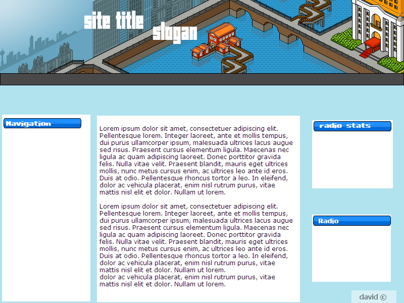
ew at the fonts, the positioning of content box headers are horendous the white backgrounds aren't too good w/o any stroke or effects and the background is.. plain.. for habbo
How could this hapen to meeeeeeeeeeeeeee? lol.
lol.
-
yes but wen its coded the backgrownd will be different init
Im a runescape player.
-
Ok, itmt change the other things i specified.
How could this hapen to meeeeeeeeeeeeeee?lol.
-
ermm if you dont mind me saying i dont like the nav buttons thing the colour of them looks a bit bright for me but then other people may disagree with me here i dunno
PM lAscend // My Profile // Report Infraction Problems // Report Reputation Problems
Away from the 3rd - 19th April!
-
Ok ill change them
 Im a runescape player.
-
I dont like it sorry but its good if its a first i jst added like a diffrent content and a diffrent nav area?
-
Agreed.
 Originally Posted by Reconix

-
Im sorry Do u think i could do a better and if so give ideas =]
Im a runescape player.
-
Anythings better than that.. no offence.

 Reply With Quote


 Posting Permissions
- You may not post new threads
- You may not post replies
- You may not post attachments
- You may not edit your posts