


I haven't designed in a loooong time and just decided to give CS3 a spin...
ratings appreciated as always.
Thanks,
David


Results 1 to 10 of 11
-
13-03-2008, 01:38 AM #1

 My latest design **RATE PLEASE /10**
I'm not crazy, ask my toaster.
My latest design **RATE PLEASE /10**
I'm not crazy, ask my toaster.
-
quite nice should work good as a layout hmm 8/10
sorry just not into mmorpgPost Meter
______________________________________________
400 450 500 550 600 650 700 750 800 850 900-1k
Green=Done | Orange=Almost | Red=Not Done
______________________________________________
Habbo fury Coming Soon!
My Img tag has ran away
-
13-03-2008, 01:59 AM #3
Thanks for the feedback
 Originally Posted by LegendOfNoob

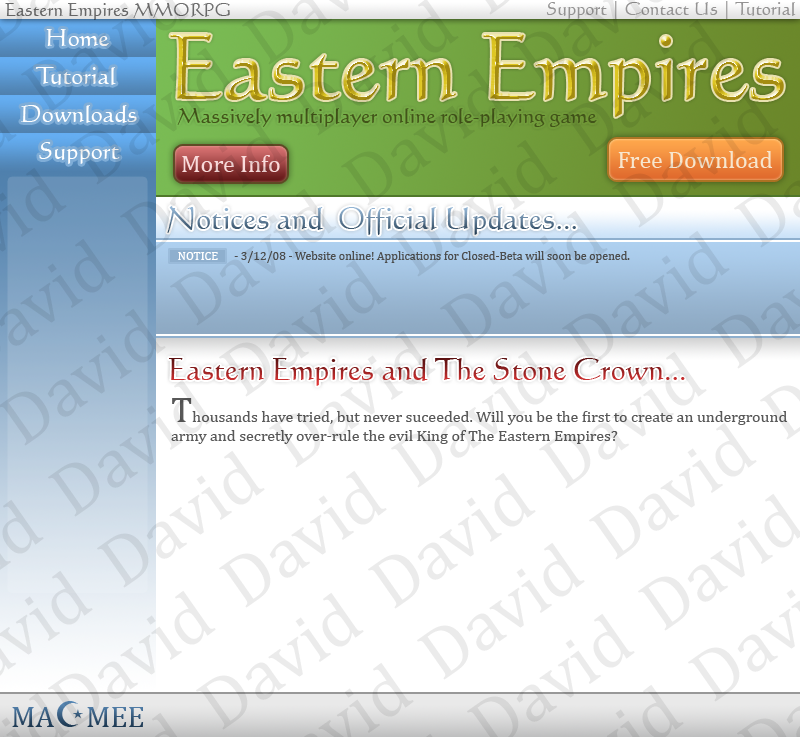
 . I've made this layout for the MMORPG I'm programming currently
  . I'm not a big player when it comes to MMORPGs, but it's fun to program them.
I'm not crazy, ask my toaster.
. I'm not a big player when it comes to MMORPGs, but it's fun to program them.
I'm not crazy, ask my toaster.
-
13-03-2008, 02:27 AM #4
Humm, I'm not too keen on it. I don't know what I don't like, its just not appealing to me.
-
It would be great for what you made it for, just to download a game with. Perfect for that!
-
It doesn't appeal to me, the only things I like are the text effects.

-
Yeah I agree with loserwill, the text looks really professional, well done.
But theres too much color going on in there, change some bits around
Loving the MACMEE logo at the bottom
-
13-03-2008, 01:39 PM #8
Thanks everyone for feedback.
Haha thanks Originally Posted by Bojangles
. I tried to make the download banner a different colour to appeal to viewers but I think I did so making the colours too different.
I'm not crazy, ask my toaster.
-
I think it would look much better if you made the banner grey.
-
13-03-2008, 01:46 PM #10
- Join Date
- Dec 2004
- Location
- Inside ur liver. Its kinda hot
- Posts
- 2,004
- Tokens
- 2,600
Or change the blue. The green and blue clash to much. Also, the nav is up to high compared to everything else. Bump it down a tad.
Posts1000 1100 1200 1300 1400 1500 1600 1700 1800 1900 2000 2250 2500 2750 3000
Rep Counter
900 910 920 930 940 950 960 970
980 990 1000
Vouches
[X]

 Reply With Quote


 Posting Permissions
- You may not post new threads
- You may not post replies
- You may not post attachments
- You may not edit your posts