
Results 1 to 8 of 8
Thread: Grunge layout
-
 Grunge layout
-
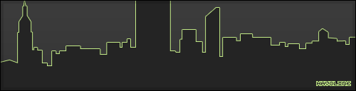
pretty good, don't like the text tho
-
make the text a bit more 'modern' like the links if u get what i mean.
-
The font wrecks it.
Back for a while.
-
 better?
-
Much
 Originally Posted by engaged

 I think you could do something better with that right side though. Perhaps an archive?
Back for a while.
I think you could do something better with that right side though. Perhaps an archive?
Back for a while.
-
well i dont really worry about the actual content, i dont intend to use this or get it coded unless somebody asks to buy it, so theres no need filling it up with content really.
-
31-01-2009, 09:20 PM #8
I think it looks really good.
Is a hippopotamus a hippopotamus or just a really cool opotamous?


 Reply With Quote


 Posting Permissions
- You may not post new threads
- You may not post replies
- You may not post attachments
- You may not edit your posts