

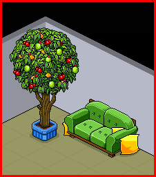
This was what I started with...
...and this is what I made...
...hopefully better than my other alts.


Results 1 to 10 of 12
Thread: Just a little edit
-
30-08-2010, 07:21 PM #1
- Join Date
- Jun 2010
- Location
- Scotland
- Posts
- 73
- Tokens
- 0
- Habbo
- .:MISTA-EMM:.
 Just a little edit
-
30-08-2010, 08:00 PM #2
I think they're both good! I prefer the green sofa though as it looks more realistic. Well done though!
 Charlie
Previous Habbox Roles: News Manager, Assistant News Manager, Senior News Reporter, News Reporter, Help Desk Staff, Forum Moderator, Events Organiser & Content Designer
-
Those colours clash and look wierd, experiment withother colours. Nice work
-
30-08-2010, 09:09 PM #4
- Join Date
- Jun 2010
- Location
- Scotland
- Posts
- 73
- Tokens
- 0
- Habbo
- .:MISTA-EMM:.
Yeh i guess they do a bit, :\ Originally Posted by dogboy123

Just nnaturally came to me, being a Rangers fan
---------- Post added 30-08-2010 at 10:11 PM ----------
Yeh I totally agree with you there =] Originally Posted by Nuxty
I just havnt done a re-colour before so I wanted to be a bit different =]
-
Not bad, keep testing out different colours
 .
.

-
31-08-2010, 10:32 AM #6

The blue and red sofa looks a bit bright imo, but I like the way you've done them. Shading ain't half bad, and it is an improvement from your previous alterations!
However, recolours are a bit basic, but I do like them!
-
31-08-2010, 08:52 PM #7

Yep I would agree with what was said you should try some different colors however I do quite like the idea of the single HC sofas
! Great effort! +Rep

-
31-08-2010, 09:40 PM #8

-
01-09-2010, 03:03 PM #9
- Join Date
- Jun 2010
- Location
- Scotland
- Posts
- 73
- Tokens
- 0
- Habbo
- .:MISTA-EMM:.
OK, BIG thanks to everyone for the advice =]
I will try a few different colours and post them later tonight.
Big thanks to iSarcastix for posting The 3-Step Guide To Creating Habbo Alterations xP really good advice in there, and if I am ever going to get better it will be through that.
P.s. Any advice helps tho =]
-
01-09-2010, 03:49 PM #10
- Join Date
- Jun 2010
- Location
- Scotland
- Posts
- 73
- Tokens
- 0
- Habbo
- .:MISTA-EMM:.

Here are 2 different colours so if they are any better feel free to share your oppinion =]
I will try some more colours, but i dont really know what colours would look good. Suggestions??


 Reply With Quote


 Posting Permissions
- You may not post new threads
- You may not post replies
- You may not post attachments
- You may not edit your posts