

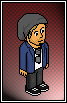
Nothing special, just a simple alt I was working on for fun. Any tips/comments? I'm not that great at the moment, but I'm trying to get better. :rolleyes:

Results 1 to 10 of 14
Thread: My attempt at a simple Alt
-
15-09-2012, 03:01 AM #1
- Join Date
- Aug 2010
- Posts
- 119
- Tokens
- 50
- Habbo
- .SuperStoked:.
 My attempt at a simple Alt
-
something dodgy about his arm, i dont think we should be able to see his shoulder and it seems a little long to me
i would personally take off the glasses and point his eyes towards the pages (probably add some lines for words too)
nice work
-
16-09-2012, 12:43 AM #3
So much better then what I can do but the arm is a little wider, other then that it's really good.
If nothing lasts forever; I want to be your nothing.
-
Fantastic, I quite like this. Just the arm is abit dodgy as Dave said but good work bud.

Ross | former senior hxhd, events organiser x5, and rare values x
-
The only problem is the arm like stated above but the rest is great. It's better then anything I could of done. Well done.
i used to put the names of my favourite singers here... then i realised nobody cared
-
16-09-2012, 01:26 PM #6
- Join Date
- Jun 2011
- Location
- Lisbon / Edinburgh
- Posts
- 5,651
- Tokens
- 17,995
- Habbo
- LiquidLuck.
The arm looks really weird S: and about the book, it doesn't look even and you need to add some lines

Apart from that, looks cool. Well done.
-
16-09-2012, 01:45 PM #7

I like it, the arm looks a tad dodgy as said above however.
-
16-09-2012, 05:04 PM #8

- Join Date
- Dec 2007
- Location
- Manchester
- Posts
- 2,236
- Tokens
- 118
- Habbo
- hamheyelliot
Nice simple alt, can't help but notice a little bit of smoothing on the face area which detracts from it a little bit!
-
17-09-2012, 03:21 AM #9
- Join Date
- Aug 2010
- Posts
- 119
- Tokens
- 50
- Habbo
- .SuperStoked:.
Thanks for the replies guys! Yeah, I agree the arm looks kinda weird but I couldn't figure out how to fix it. Gonna try shortening it a little, and maybe widening it a pixel or two. As far as the shoulder goes, I figured the shoulder should be visible. He's supposed to kinda be leaning towards his left, with his weight on that arm. I agree it looks a little off though, not sure how to fix the shoulder area.
I was totally gonna add lines to the book's pages, forgot all about that! It's not supposed to look completely even though, I wanted it to be a little sideways (cuz when ur reading irl, when do you always have it straight? ), but yeah, probably would have been for fitting for Habbo to have it straight.
The face... argh, I worked a while on the face and tried a few different things. The first two times I tried PS's transform tool, with and without the (what I call) the "blur/smooth option". The one that blurs on re-size was of course too blurry, and the other option was just way off on its pixels. I also tried to completely make the face from scratch, but never could get the aspect right. I ended up just using PS's transform tool (with blurring) and then tried to fix it up the best I could. I think around the glasses is where I notice it the most, I tried cleaning it up more in that area, but afterwards the glasses always turned out to look blocky. Any ideas?Last edited by MultiKaching; 17-09-2012 at 03:28 AM.
-
Good alt, although I think his head looks a bit funny. The angle it's on just looks weird. Awesome attempt though! Well done.

 Reply With Quote


")

 Posting Permissions
- You may not post new threads
- You may not post replies
- You may not post attachments
- You may not edit your posts