

Well, after so many of time of not making Pixel Art, and using a program not as good as MS Paint, I ended up doing Ziggy Stardust (David bowie) in his Aladdin Sane album.
His original hair is orange, but I think it looks cool pink.
What do yo think? The hair is a little ugly isn't it?


Results 1 to 5 of 5
Thread: David Bowie
-
 David Bowie
-
Hairstyle itself doesn't look like what i would go for IRL, but you're actually trying to go for realism and it does match the album cover (had to google it :¬
 very well. Both colours look pretty good, though I'd be inclined to say that you need a tiny bit more contrast on the hair for the benefit of shading, just like on the album
  Also the right side seems a tiny bit flat but that is probably just me!!!
Great work overall though, very impressive! +rep
OH also the corner of his face is reallyyyy sharp/pointy so try adjust that at some point.
Also check out pixel art applications if you havent already xxxxxxx LINK: http://www.habboxforum.com/showthread.php?t=817201 the post at the bottom.Last edited by MKR&*42; 05-12-2014 at 05:35 PM.
/
-
Thanks for the +rep and the invitation to the pixel art application!
Yes, the hair is a mess, I need learn to make hair x)
I changed some things, and made a little composition:

-
05-12-2014, 09:14 PM #4
Hi. Since you're new to the forum and haven't posted any graphics before, do you have any WIPs?
-
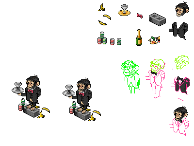
I had a WIP of this but accidentally over-wrote it :S
I just have this WIP ofthe monkey I did some weeks ago:


 Reply With Quote


 Posting Permissions
- You may not post new threads
- You may not post replies
- You may not post attachments
- You may not edit your posts