


Hello!
Just wondering why the events box on Habbox.com is so low down? I think it needs to be in a place that stands out and is visible near enough straight away and should take priority over things like wiki edits, forum posts and twitter updates? I think Events and Shoutouts are two of the most important widgets on the site and having them so low down seems weird and may detract some first time visitors from viewing them.
I'm sure you can probably move the boxes around if you can be bothered to make an account or log in to the main site, but for visitors I think events should be near the top for sure!
I think a major first impression is got from the static page that you land upon when visiting habbox.com (without scrolling), and to me (on a standard size laptop screen) there really isn't much content on that initial screen. There's not a permanent logo half the time, so if I was just casually flicking through fansites I would probably forget the habbox one immediately due to a lack of sense of identity throughout.
I think one thing that certainly doesn't help is the advertisement banner slap bang in the middle for me which is always the first thing I notice, rather than anything Habboxy! although I know this can't really be helped!
Results 1 to 10 of 13
Thread: Boxy Widgety Thingees Ordering?
-
27-09-2015, 05:20 PM #1

 Habbox Merit
Ex Assistant General Manager (Community)

 Boxy Widgety Thingees Ordering?

YOU CAN WIN STUFFS BY ENTERING COMPS! CLICK ON THE PICTURE!
Former:
Forum Moderator (x2), Forum Super Moderator (x4), Assistant Forum Manager,
News Reporter, Assistant News Manager, Events Organiser (x3), Competitions Staff (x2), Senior Competitions Staff,
Rare Values Reporter, Trade Expert, Senior Events Organiser (x3), Assistant Events Manager (x2)
Forum Manager, News Manager (x2), Acting HxHD Manager, HxHD Room Owner, Assistant Comps Manager , Events Manager -
Assistant General Manager (Community), Articles Manager
-
-
this is the order of mine, and i still cant rearrange them.


-
27-09-2015, 07:38 PM #4
Habbox Merit
Ex Assistant General Manager (Community)
Oh wow, I didn't realise it was different for everyone then!
Mine is the same as yours Dave but the Events one is below the Requests and Shoutouts one
YOU CAN WIN STUFFS BY ENTERING COMPS! CLICK ON THE PICTURE!
Former:
Forum Moderator (x2), Forum Super Moderator (x4), Assistant Forum Manager,
News Reporter, Assistant News Manager, Events Organiser (x3), Competitions Staff (x2), Senior Competitions Staff,
Rare Values Reporter, Trade Expert, Senior Events Organiser (x3), Assistant Events Manager (x2)
Forum Manager, News Manager (x2), Acting HxHD Manager, HxHD Room Owner, Assistant Comps Manager , Events Manager -
Assistant General Manager (Community), Articles Manager
-
27-09-2015, 07:38 PM #5

wait did v7 eventually launch
-
if u want to call it a launch
 Originally Posted by scottish

-
27-09-2015, 07:48 PM #7
 The Santa of Habbox
HabboxLive Guest DJ (Conor)
Guest Events Organiser
HabboxWiki Staff

This is mine without logging in
http://prntscr.com/8l5yrc
Conor
FUNISMYME on Habbo
Guest HabboxLive DJ & Guest Event Host & HabboxWiki Staff & Competitions Staff
Previously one of the longest running HabboxLive Senior DJ, Ex Event Host, Ex Competition Staff, Ex Article Writer, Ex Help Desk Staff
See something on the Wiki that needs updating? Feel free to PM me info and I'll get it sorted.
-
27-09-2015, 07:50 PM #8
mine was like kyles, i moved one below the other and suddenly every other box moved above the one i moved lol
- - - Updated - - -
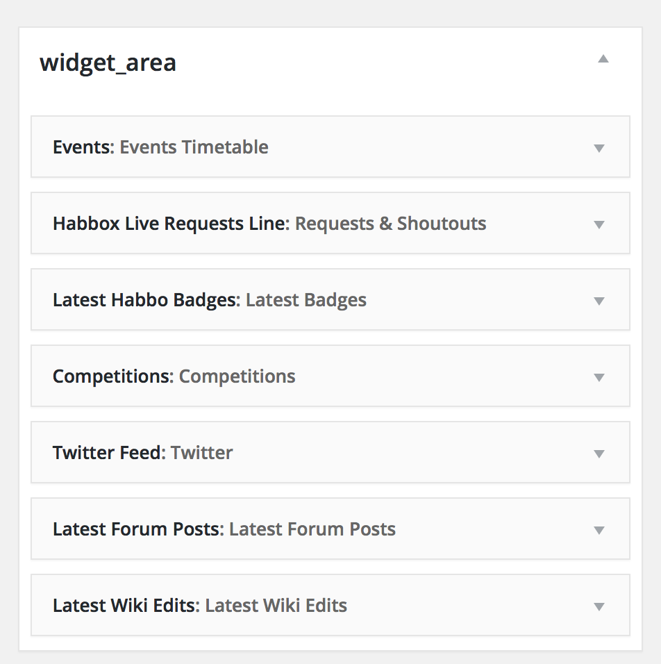
It's
1) Events Timetable
2) Requests & Shoutouts
3) Latest Badges
4) Competitions
5) Twitter
6) Latest Forum Posts
7) Latest Wiki Edits
If you try to move any box then after you refresh it'll become
1) Competitions
2) Twitters
3) Latest Forum Posts
4) Latest Wiki Edits
5) Events Timetable
6) Requests & Shoutouts
7) Latest Badges
-
mine goes, comps, forum, wiki, events, requests, twitter, badges
-
28-09-2015, 10:01 AM #10

The official order of the widgets is what is shown in the image below:

Previous Habbox Roles
Co-Owner of Habbox | General Manager | Assistant General Manager (Staff) | Forum Manager | Super Moderator | Forum Moderator

 Reply With Quote


 Posting Permissions
- You may not post new threads
- You may not post replies
- You may not post attachments
- You may not edit your posts