

Yes this is what happens to me during the boredom stages of my life.. please rate it and tell me what should be changed, obviously its not a real site ot layout as there are things id change already but yanno Enjoy!
Although i might use it if i was to make a hosting site
Results 1 to 10 of 21
Thread: As a result of Boredom
-
 As a result of Boredom
Last edited by Dj-dids; 17-04-2006 at 01:33 AM.
Why i've now removed my image because people are "offended.... whatever!

-
17-04-2006, 01:37 AM #2
- Join Date
- Dec 2004
- Location
- Inside ur liver. Its kinda hot
- Posts
- 2,004
- Tokens
- 2,600
Dude its pro
10/10 easy.
Very nice design
If you do want to use it and make a hosting site out of it contact me I can hook you up with resellers for dirt cheap
Btw +repPosts1000 1100 1200 1300 1400 1500 1600 1700 1800 1900 2000 2250 2500 2750 3000
Rep Counter
900 910 920 930 940 950 960 970
980 990 1000
Vouches
[X]
-
the font, deffinately
EDTALKING
-
-
17-04-2006, 09:24 AM #5JoeComins Guest
Dont like it 5/10
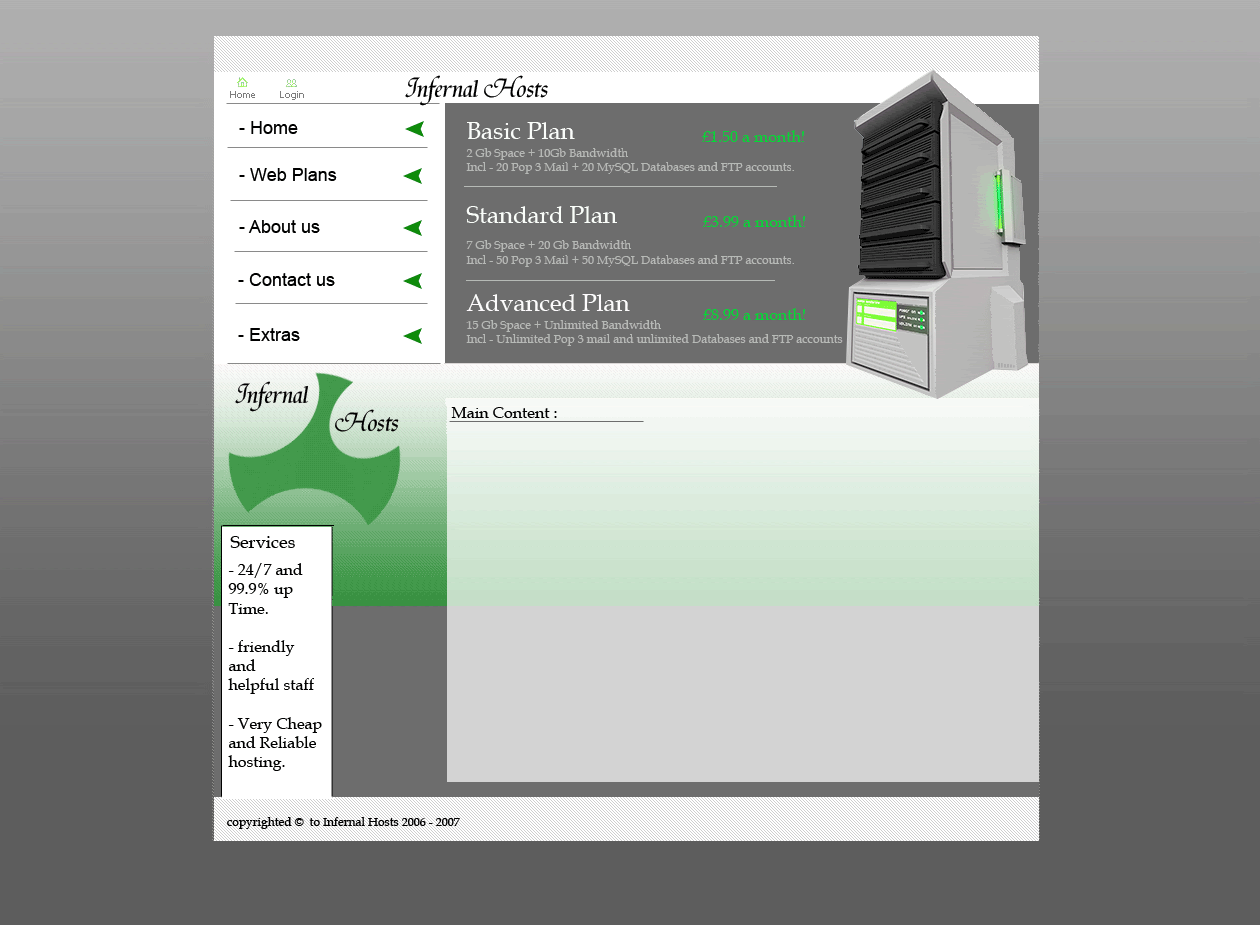
It looks like your thrown bits together, but not throught about it
1. The services box looks cheap and naff - Change it, and make it more professional and in keeping
2. The £_.__ is an awful colour. So it the green gradient down the side ''/
3. You have a white>Green gradient in your nav, tehn it cuts off completly and turns to solid grey ''/ Doesnt look very nice of professional
4. The plans arnt inline with the content box, and it makes it loook cheap ''/
5. The naviagation looks too big - It needs to be smaller, and the text is also very bad.
6. I dont like the internal hosts text - Looks new and cheap, trying to be old and classy
7. The rendering of the server is bad
Everyone here likes it, so just ignor me. 5/10 - Read my errors
-
goes
6/10 nice but 10/10 no way
server looks bad and content thingy box goes futher than everything else i mean some of joes templates dont get 10/10 so why should this its nowhere near as good
-
-
Thx:
Nav: i'm not good with fonts as you can probably notice from my signatures that i've posted here.
The Services box : i was going to make a flash box there but i coudlnt be bothered in the end i still might tho.
The £_.__ : I like it so shuv it lol . it stands out slightly :S it was between that or white.... you choose?
The "Infernal Hosts" Font : like i said before i am absolutely no good at picking fonts :S its just not my thing lol.
"Bits" : i did not throw bits together, it was just whatever i could find lol so basically ye , but at least i tried to stick with a green scheme.
The grey : Got any other ideas?? i didn't want it to look plain :S so i completely threw something in! Any ideas would be gratefully appreciated.Why i've now removed my image because people are "offended.... whatever!
-
Couldn't have put it better myself. Sorry but it just looks awful. 4/10.
 Originally Posted by JoeComins
Rob

People who I respect
RichardKnox | Nets | JoeComins | Raremandan | Embrace | Css | Encryptions!
I love Christmas too much - Im looking forward to it already!
-
Now this might sound, well "*****y" but , i could take that from Joe since he makes some amazing stuff, but could you please direct me to some of your good work? ( does not include that crude siggie ). Please?? Because no offense to judge someone else you got to know yourself first.
Last edited by Dj-dids; 17-04-2006 at 10:40 AM.
Why i've now removed my image because people are "offended.... whatever!

 Reply With Quote


 Posting Permissions
- You may not post new threads
- You may not post replies
- You may not post attachments
- You may not edit your posts