


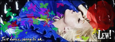
I really like it, Only thing that spoils is that blue colour.. Its not, 'painty'
Results 11 to 20 of 27
-
 CPU i5 3570 @ 4.2 GHz | Mobo GigaByte Z77D3H | RAM 8GB | GPU AMD Radeon 6870 | OS Win 8 64-bit | HD 1TB HD and 128GB SSD | Wheel Logitech G27
-
i like it :] +rep.
-
Oh ok , I was stuck on what to put as a navigation then i just had a idea why not put a speach bubble , I probabaly got the idea from subconsciously remembering one of his layouts , its just popped into my head.
 Originally Posted by L!nK

To what lol? i've tried different colours but it doesn't seem to work Originally Posted by =gamemaster=

I'll try changing it later Originally Posted by Sunny.

I'm going to +rep everyone that's replied so far.
-
i like the nav, its detailed but not in your face
If you have any queries or questions, just PM me!
:eusa_thin
-
Looks fairly good. (Y)
-
lol, the ones I used were made by me yes but he is using the Sulake ones so its fine.
-
Ah right lol sorry for getting it wrong, but it did look like it

-
30-08-2007, 09:32 PM #18

- Join Date
- Oct 2005
- Location
- Corby
- Posts
- 5,515
- Tokens
- 2,926
- Habbo
- cabbage (origins)
i think its brilliant and the blue works
no
-
-
OK. I haven't done a detailed C&C in a long time, I may aswell give you some pointers.
Firstly I'm not to sure how to describe this, as I have seen designs similar. But, basically when I look at it, I get confused as you have a square content box, yet everything else is rounded; which to me looks faily odd. On the other hand, I can see why you done that as your banner finishes with a horizontal rule.
Secondly, I hate those colours, I dont know if it's a personal thing, but they're disgusting. If you are stuck on colour choice I recomend Dulux (yes, the paint company) they have an oustanding choice of colours, and they even tell you which colours contrast etc. If you want to be a little clever, try and use the colours used in the baner, so the colours flow and they aren't big block sections of colour.
Thirdly, the navigation. This is where it loses me kind of. As in the first coment, you have a square-ish design, yet the callouts are round... You should decide weather you wanted a rounded design or a square design. I may be contradicting, as I have seen designs that are both, but for some reason yours isn't working.
Although you may want to keep your navigation the same, I recomend it being lighter, and more bold so it attracts the user's eye, as this is the vital for the user. You have white, contrasting images which stand out, yet your navigation is dark and dull, when it quite possibly should be the reverse.
Finally, I think the background isn't suited to your design, your design is trying to be bright and vibrant, yet your background is holding it back. The background is sharp and crisp with blocked edges, where as your design has curved edges on the surround.
I think that is all I can come up with at the moment, just looking at it for the first glance. Good luck with the designs, and keep up the good work.


 Reply With Quote


 Posting Permissions
- You may not post new threads
- You may not post replies
- You may not post attachments
- You may not edit your posts