


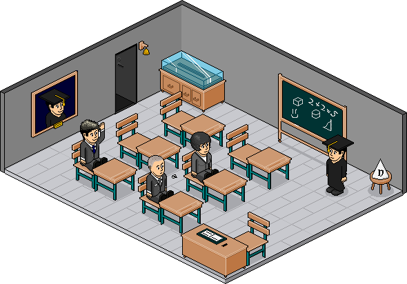
I took T0MM0's advice and made a Catalogue Page and a Classroom with the shading advice given by Siz:
I've added some extra furni too (the bell and the teachers portrait)
I couldn't be bothered making smaller versions of the furni, so I just shrunk them:
Results 1 to 10 of 30
-
 Catalogue Page and Classroom for School Furni

-
I was right in the mood for slating the hell out of an alt but I can't really find anything blatantly wrong with this. The only thing I would comment on is being more adventurous. You've used the same desk and chair 6 times over. Maybe do some books on top or some pens or even a chemistry set. Overall, really nice. And I'm so proud of you to stop using black lines inside of alts. XD
-
25-10-2007, 11:28 AM #3
I think you should move the "old School" text higher up. It just doesn't look right there
Ex-janitor. Might pop in from time to time, otherwise you can grab all my information from http://jamesy.me.uk/
-
owow thats REALLY good
-
I know, on my past recent catalogue alts, I've been moving things about to give the page an updated look, it put it there cause I wanted it so overlap with the desk, but I still wanted there to be enough distance from the top of the page, so I just stuck it there
 Originally Posted by iSuck

-
*Double Post* :S
Took your advice again and reworked them , just added some little touches:
-
25-10-2007, 12:20 PM #7

That's really nice, you've made the room fit the furniture and the teacher nicely. It's quite the collection.
-
25-10-2007, 12:28 PM #8
much better.
Ex-janitor. Might pop in from time to time, otherwise you can grab all my information from http://jamesy.me.uk/
-
I actually was gonna add another thing, but I could edit it cause it had been longer than 15 minutes :S, so here it is Originally Posted by Agesilaus
(No point in having the full alt)

-
25-10-2007, 12:42 PM #10
Don't like the dunce hat to be honest. Don't look positioned right. (I am never happy amirite?)
Ex-janitor. Might pop in from time to time, otherwise you can grab all my information from http://jamesy.me.uk/


 Reply With Quote


 Posting Permissions
- You may not post new threads
- You may not post replies
- You may not post attachments
- You may not edit your posts