


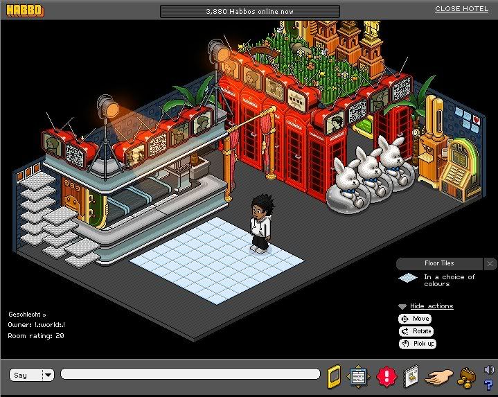
Need some ideas to improve it, didn't take me too long. I had majority of it for months but I added the mode things to make it look like a bar/private area.
Ideas welcome, +rep if they're good..
Results 1 to 10 of 17
Thread: World Rave ~ My Club ~
-
17-04-2008, 10:17 PM #1

 World Rave ~ My Club ~
Last edited by Zak; 17-04-2008 at 10:23 PM.
-
I actually quite like it, even has a little private area under petals
Cant wait to see it full on Chat, Chill and Discussion section on the navigator
Search arrow2555 on UK Habbo for a Brand New Trade Room
-
Nicely done

best room i've ever seen lol
-
The floor tiles spoil it imo, maybe use a few floor ties to cover the whole dancefloor or use other carpets (eg. Habbowood tiles)
shawn
-
You close another Habbo browser btw thats why the weird font.
Don't like it sorry.
-
Not being bad and +rep because its a nice room but nothing RAVE about it i been to RAVES and thats nothing like one.
It would be better if you had a mood light to change the lighting that would help and use furni that anit Rares it helps unless its parasols or w,e there called but +rep on the room 8/10
-
18-04-2008, 10:20 AM #7
I know why my font is like that
 Originally Posted by superMIKE

and ok what makes you not like it?
-
i think its pretty good 8/10 i dont rly likes stacked petals but they fit in quite nice there
Ryan
-
+Rep for creativness.
Basiclly, you only need to remove the yukka, and it'll be great!"There are only two important days in your life: the day you are born, and the day you find out why."
Mark Twain
-
i dont like it that much sorry

 Reply With Quote


 Posting Permissions
- You may not post new threads
- You may not post replies
- You may not post attachments
- You may not edit your posts