

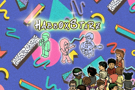
Second ever layout.
Went for a buiness/profile type layout.
Pretty basic, but yeah.
Suggestions/Feedback
Results 1 to 10 of 15
Thread: #2 - Layout
-
 #2 - Layout

Money sent via Paypal. Lowest payout $2.
-
If it's your second ever layout - why the name "Bua
 esigns"?
-
He might design things that aren't web layouts/designs...
And yeah pretty basic, and the text looks off.
-
It's really simple and basic.
The colours doesn't really fit in with eachother
Looks too plain
good job for second though
-
I think it could do with being a bit wider. But its okay for your 2nd go
-
Because I don't design web layouts maybe?
 Originally Posted by Calon

Money sent via Paypal. Lowest payout $2.
-
Truely honest a 7 year old could do better,
Anyone without photoshop could in pain
Anyways Keep up the work, need to start from somewhere
-
Paint has a gradient function? pomfg. Originally Posted by DANDAN
Money sent via Paypal. Lowest payout $2.
-
Paint.net sonny. Looks horrid, the colours are bland and they clash. Try going through some photoshop tutorials, using some brushes and going on colourlovers.
Back for a while.
-
You could make that really good by changing the banner colours, making it look more professional and adding more content boxes. Also make it wider.
Not bad for your second go.


 Reply With Quote


 Posting Permissions
- You may not post new threads
- You may not post replies
- You may not post attachments
- You may not edit your posts