

I tend to do it in paint, using habbo content boxes and changing them a little. Then i do expandable divs to code it. Simple really.Originally Posted by -x--Jessica--x-

And anyway his layouts not that bad as a normal layout (excluding the big fonts) but its just not habbo.
Results 11 to 18 of 18
-


TURN AROUND BRIGHT EYES
-
So basically you've just done what every photoshop nooby does (including me at one point.) Thrown it in PS and used the gradients. I would focus on adding some more solid colour, by that I mean not all them glossy gradients.
Back for a while.
-
20-12-2008, 04:50 PM #13
- Join Date
- Oct 2007
- Location
- Luton, England
- Posts
- 1,548
- Tokens
- 388
- Habbo
- DeejayMachoo
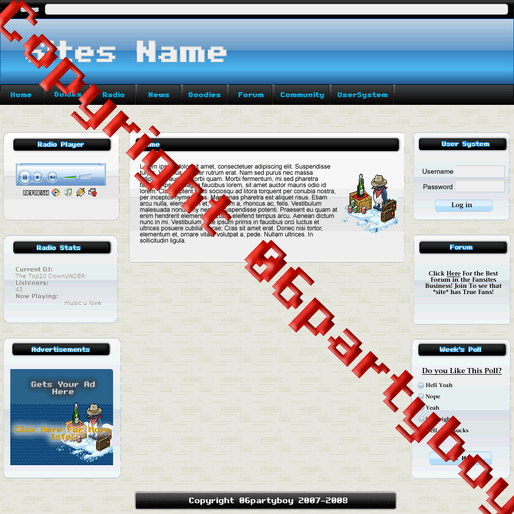
They wouldnt look so bad if the font sizes were smaller..
-
Terrible tbh
 Back for a while
-
Some tips for improvement

- Use the same font for all of the layout
- Avoid black backgrounds for whole boxes (its okay to use them for headers and footers ect)
- Keep the same amount of spacing between each box (around 5-10px is a good amount.)
- Don't use so many gradients
-

Wow Thanks all you guys for the tips and i use adobe Firework cs3~!:eusa_whis
:werock:
Yes They DO!!!
-
Hey, layout 2 looks like you may have pottential.
You're on the right path, just you shouldn't stretch them like that, they should always have a nice font size, as the font's in that layout must be like 72, which is huge, for a header, as I said you're on the right path you just need to look at a few other fansites that have nice layouts, and try making something a little like it, don't rip it at all, just look at the color schemes and font sizes, how they're at a good size, not to huge or to small.
Also, you're using a good designing program, don't let anyone trick you into using photoshop, learn how to use fireworks until you can design fairly well then move onto photoshop - it's pretty advanced, I don't use it myself yet.Last edited by Calon; 21-12-2008 at 01:37 AM.
-
 Originally Posted by Calon
Wow You are only Person That gave me so much Tips.. +Rep Thanks
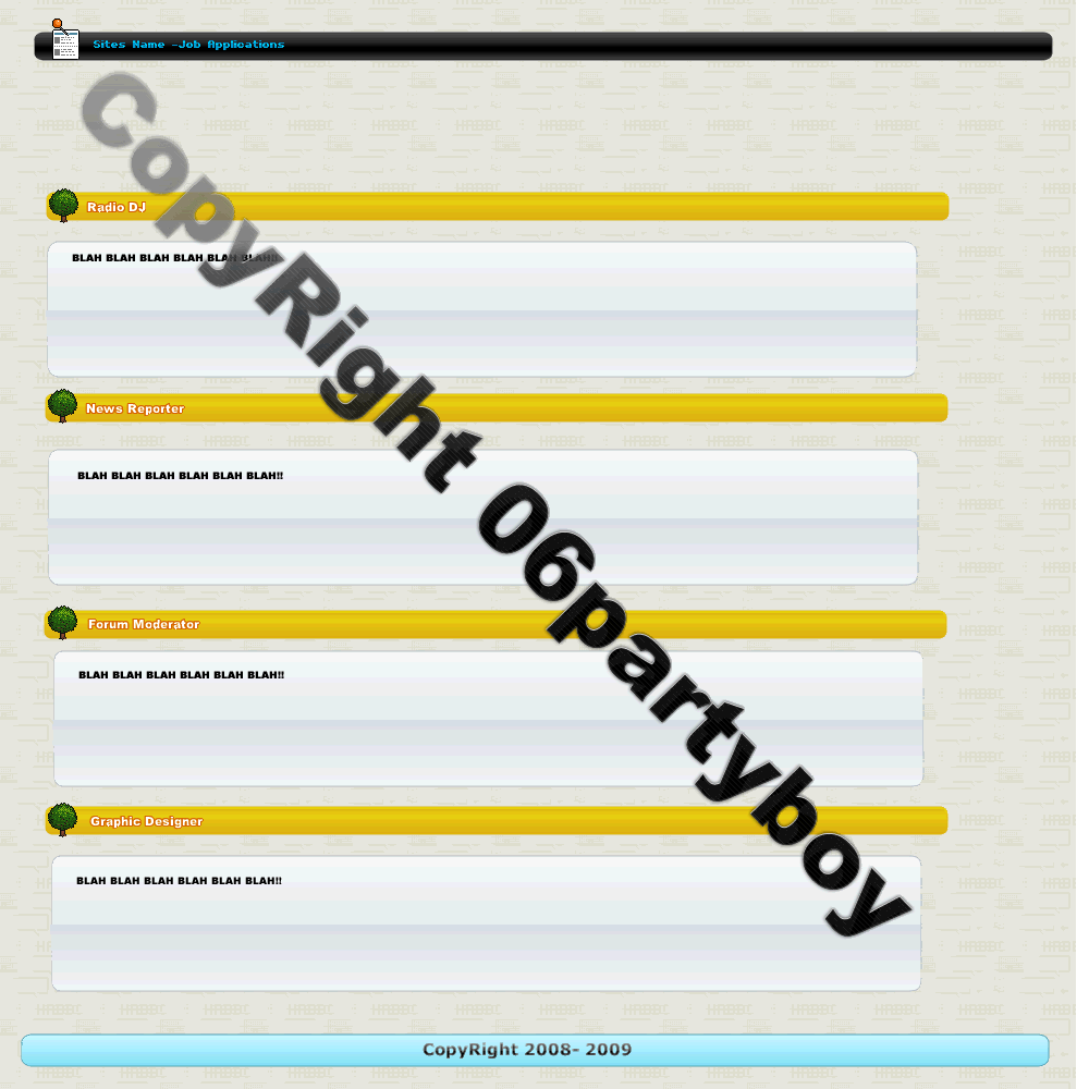
Btw: I fixed The 2 layouts Here they are.
:werock:
Yes They DO!!!

 Reply With Quote


 Posting Permissions
- You may not post new threads
- You may not post replies
- You may not post attachments
- You may not edit your posts