


on habbox.com, wouldnt they be better to be enlarged properly?
something like that, I only just had a quick play around.
Results 1 to 10 of 18
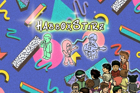
Thread: Big heads...
-
 Big heads...
-
I think the whole image should be changed... ugly.
-
I liked the idea and when Yonder was making the skin I had ago at doing the same thing for him then and it looked pretty good. But like that, just stretched I dont like it, I like it though

-
I don't like enlargements with thick lines where you can see the pixels.
-
14-08-2009, 12:50 PM #5
 ditto
ditto Originally Posted by Hazza


cake
-
14-08-2009, 01:02 PM #6
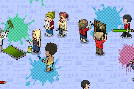
 See I like this as it does show what habbo is at the end of the day, just pixels, but most of the people in V5 wanted to change it do something else. However we lacked a gfx team back then and couldnt come up with any ideas. Originally Posted by hmv
-
you still do lack a gfx team
-
14-08-2009, 01:33 PM #8
Just one big long banner at the top would look better imo and maybe have a little area that changes like the billboard things from habbo. And then bring back the latest headlines bit along the top

cake
-
yeah and they fired that extra person whow as probs there best gfx staff Originally Posted by GordonBanks
-
14-08-2009, 01:42 PM #10
damned if we do damned if we don't.....


 Reply With Quote


 Posting Permissions
- You may not post new threads
- You may not post replies
- You may not post attachments
- You may not edit your posts