


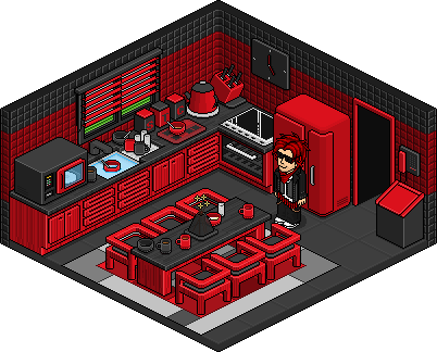
I'm not a big fan of the chosen colours but I think it looks really nice. I love how you've made it modern, especially the clock and the microwave
.
Results 11 to 20 of 23
Thread: Mini Alt - Kitchen
-
19-07-2011, 05:53 PM #11
- Join Date
- Feb 2008
- Location
- London, UK
- Posts
- 15,747
- Tokens
- 25,786
- Habbo
- Mr-Trainor


Not online very often
-
19-07-2011, 08:12 PM #12
Thats a really nice and modern kitchen! Great color choices IMO too
+REP!
-
The hob seems a little too shiny but apart from that and the amount of red it's really excellent. :]
-
19-07-2011, 08:40 PM #14
Wow, nice.

-
19-07-2011, 10:12 PM #15
That looks great!
Search Varnius for Habbo's Official Trading Room.
-
20-07-2011, 07:06 PM #16
I dislike the constant use of red, got to say that but that is purely opinion so moving on. I think you crammed too much into one space on the counter and it would have looked nicer with less on there and maybe have extended in a direction adding a couple of extra cabinets to put more stuff on there instead so it doesn't look so compact. I would also say the table area doesn't look like a kitchen table but again, purely opinion. Nice alt with no flaws I can see, except the corner of the tiles being a bit dodgy. Oh actually, I do thing the upside down mugs looks a bit weird and not quite circular.
 Originally Posted by .Sarcastix.

-
23-07-2011, 09:42 AM #17

Wow, that's fantastic! The red and black are so futuristic! +rep
Need help recolouring? Here's my tutorial : CLICK HERE
Need help creating pixel art? Here's my other tutorial: CLICK HERE
-
23-07-2011, 10:03 AM #18
- Join Date
- Oct 2005
- Location
- Spain, Valencia
- Posts
- 20,492
- Tokens
- 3,575
- Habbo
- GoldenMerc
Absolutely amazing!
-
23-07-2011, 10:18 AM #19

- Join Date
- Nov 2008
- Location
- Hull, E Yorkshire
- Posts
- 790
- Tokens
- 176
- Habbo
- ImGonnaExplode
I think this is brilliant!
the one thing i see a problem with as stated above is the kettle it looks a bit wide to me aswell...
other than that, its great work!
+REP!20, all things rugby league...and Arsenal. Youtuber from Hull, 50,000+ Subscribers.


-
23-07-2011, 01:29 PM #20

I like the colour scheme you chose. Great job!

 Reply With Quote


 - Click


 Posting Permissions
- You may not post new threads
- You may not post replies
- You may not post attachments
- You may not edit your posts