

nice vending machine, but it needs to have some shading and itll look brilliant 7.5/10
Results 11 to 20 of 21
Thread: ANOTHER VENDER!!!!
-


-
21-07-2006, 12:08 PM #12
Shading and I don't like that bottom bit (I don't know what it's called but that's where the soft drinks comes out lol)
Please visit my websites (yn)
http://ks3sci.webs.com/ to revise Key stage 3 Science
http://igcsechem.webs.com/ to revise I/GCSE Chemistry
http://plain_indians.webs.com to learn about the plain indians
http://medic4u.webs.com for first year medical notes
http://medics4u.webs.com for second year medical notes
http://catchetat.blogspot.co.uk/ to check out my blog (as a boring medical student)
-
I like it, but some minor improvements needed.

xx
-
6/10 Pixel erros, Bad main color and needs shading.
-
-
Plus well drawn food and I'd say 10, I really like it for some reason.
-
like every1 said needs shading and food wud be nice or its useless
cept that its ok
-
23-07-2006, 02:32 AM #18
- Join Date
- Jul 2006
- Location
- Manchester
- Posts
- 250
- Tokens
- 0
- Habbo
- ..::FREWIN::..
freak, it looks cool. u made some errors tho. i fix in mornin+ try 2 ad food

Cannot believe you made me cut 10px from the bottom of my sig.
-
23-07-2006, 12:19 PM #19
- Join Date
- Jul 2006
- Location
- Manchester
- Posts
- 250
- Tokens
- 0
- Habbo
- ..::FREWIN::..
KK sorry 2 double post:
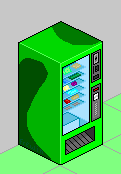
With Background:
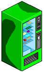
Without Background:
Cannot believe you made me cut 10px from the bottom of my sig.
-

 Reply With Quote


 Posting Permissions
- You may not post new threads
- You may not post replies
- You may not post attachments
- You may not edit your posts