


Thanks,
Wootzy its fixed
Results 11 to 20 of 23
Thread: Computer
-

-
8.9/10 like wootzy sed the mouse looks dredful
-
doesnt look different
thats my laptop screen I did
mine has more detail
(i had old/new look)
-
Grrr im adding detail to the screen and refresh the page a few times to see an updated version
Edit : Its done - Yours would of been easier as it was on a bigger scaleLast edited by Anderman; 20-02-2005 at 08:01 PM.
-
20-02-2005, 07:50 PM #15

- Join Date
- Jul 2004
- Location
- The blue, green marble
- Posts
- 5,768
- Tokens
- 5,388
10/10 excellent effort.
although the console is slightly wonky compare to the hard drive.Resigned from Habbox.
 Originally Posted by Misawa
-
8/10. -1 Because of the mouse

Nice detail on the homepage but wootzy's is way better.
+5Rep
My rep power IS 5 :p
-
Thanks again for the comments.
Rt7 - Wootzys is better because his was on a bigger area so theres more room for detail - Im going to have to make a bigger screen version
-
Mouse - Looks like a sausage
Monitor - It can't be stood on the vertical base, it would need something flat to rest on the desk, otherwise it would tip over.
Monitor (again) - The stand is not in the middle of the monitor. The way you've drawn it, it would surely fall over.
Asking for extra marks/hinting you want rep - minus a point
I give 6/10People who deserve a mention:
Janeh JackHB Properclone Spectate Jrh2002
I would add more, but I'm lazy.
-
Ok ,
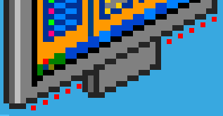
1stly The moniter is in the middle look at the pic below - Every dash shows 2 pixels and theres 5 dashes on both sides.
2ndly I am improving the mouse as you read this and adding a stand to the LCD *Edit - Screen is fixed
3rdly I was asking for extra marks for the moniter as i put a lot of detail into it and i was asking for rep if they liked it, wich you do clearly don't so it doesnt really matter to you.
Last edited by Anderman; 21-02-2005 at 05:37 PM.
-
sweet picture 7 thumbs up

 Reply With Quote


 Posting Permissions
- You may not post new threads
- You may not post replies
- You may not post attachments
- You may not edit your posts