

I like that alot 9.5/10 As the font isnt great
Results 11 to 20 of 40
Thread: "Emo" blog design.
-

-
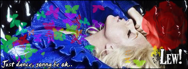
Whats the font on the banner?
The one with wings it's nice :]
also 9/10

-
I dont like it, probberly because im not emo. LOl i like the first bit of the site where you need 2 click enter or w.e
If you have any queries or questions, just PM me!
:eusa_thin
-
In addition to the shotgun comment. It looks pretty horrible to anyone not useing the screenres the wallpaper your useing as a background fits to, the repetes look pretty tacky and misaligned, you should ether get a backrgound that will look right for people with bigger screen sizes or center it as a ridgid layout. Doing nether aint a good idea.
The font used in the layout dosnt really fit, its far to formal looking. The nav being text based doesnt fit with the highly graphical theme of the rest ether, it also has some pretty dodgy spaceing.
The bottom bit, with all the w3 standards and copyright, dispite just being an image looks pretty good as does the logo on the spash page. Although it doesnt fit well with the red used on the main site.
So im not really a fan, doesnt appeal to me. Secondly as a more bias point your giving a bad name to british teens. *regrabs shotgun*


-
Not bad although I think that somewhere in there you should technically credit the creator of the font you used as the "wings" are just part of the font file and you are kinda using it as your logo :S just a thought?
But other than that it looks pretty good, but bg does load slow
-
V. Nice template, but as other people said, BG Takes forever to load :]
Emoz FTW.:8 Originally Posted by Chippiewill

-
07-05-2007, 09:19 AM #17
NOOO! WE ARE LOSING HIM*
*Before mods infract me, I was joking seems to Si making his life into an emo.
-
Love it +rep once the server lags gone
I think you've just inspired me for my next few templates.
BTW: it did't take long to load at all for me.
-
I like the whole thing really. Nice use of colours and various effects across the page. Nice use of the header font. The whole thing looks generally great Simon! Well Done 9/10. Also I like the domain name, well done.
 + rep. Only one negative comment (you knew it was coming!) the background does load a little slower than the rest of the layout, OK for most people that wont matter but for the people who have slower internet connections I could be slightly annoying. Anyway overall its great!
Last edited by Mr.OSH; 07-05-2007 at 10:17 AM.
-
mmm, nothing much there to rate or comment on.
On the welcome page you could embed the background so it downloads it into the cache and then when you go onto the next page it will be there / take less time.
If the sites about emos then it should look emo, at the moment it doesn't really look emo at all.

 Reply With Quote


 Posting Permissions
- You may not post new threads
- You may not post replies
- You may not post attachments
- You may not edit your posts