
Results 11 to 20 of 22
Thread: Graphics Direct -
-
 PM me for help.

-
18-11-2007, 02:14 PM #12
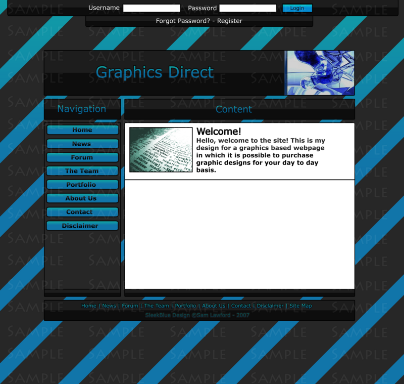
That looks A LOT better. Seriously. Sometimes it's best to go back to basics. Do the same for the text on the bottom bar. And perhaps the nav and content bar. I don't know how they will look though.
Ex-janitor. Might pop in from time to time, otherwise you can grab all my information from http://jamesy.me.uk/
-
Better than what is was, but still unproffesional and horrid. Sorry, but just look at it.
Also no need for the -Rep. I am giving you my honest, professional, graphic designer opinion.
-
That's professional?
 Originally Posted by iHubz

Honestely Darren it's his first atttempt.
Just leave him alone.
-
It hurts my eyes.. too much blue and black for me. If you have too much, it just ends up looking all blurry and all you see is blue and black.
http://www.colourlovers.com/
Try that site and pick a nice palette :]
-
Sorry but that is awful, You should pay someone to make you one, Beceause by the looks of that layout you aernt a very good designer
Leftxxx
-
it's his first try.
-
First site I ever made. Im building up my skills as this is the career I want to go into.
PM me for help.
-
18-11-2007, 09:54 PM #19
I would say make every bit of text, except the banner and main content (white background anyway obv :rolleyes

On the buttons etc.Ex-janitor. Might pop in from time to time, otherwise you can grab all my information from http://jamesy.me.uk/
-
I did, It looks bad on the content title and stuff, The site map looks better though.
PM me for help.


 Reply With Quote


 Posting Permissions
- You may not post new threads
- You may not post replies
- You may not post attachments
- You may not edit your posts