


Well.. Basic. 4/10
Results 11 to 20 of 25
Thread: snazzy bed
-

-
hey man no offense but that bed is retarted..its like for crazy people. So when they go to sleep they get calm by the rainbow colors :s
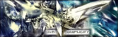
Winner of Graphic of the Week Awards 5th December 2005
Winner of the 2005 Christmas Graphic of the Week Awards
-
I suppose it's different. Room for quite a bit of improvement. But good try
 4.5/10
-
Try actually constructing the stripe things out of pixel lines and then filling them in, rather than just grabbing a big brush and slapping shapes on.

DesignHall.com -Check it out for galleries and tutorials on using photoshop, paintshop pro and other graphic design programs.
.___^__^___
(___ o.0____)
........' '
This is Ravid the Hampster.
Copy him into your sig and he'll eat you.
-
well..... I done like it no offence but it has groovi colour u have good style
-
Its Different.. Not Sure If Thats A Good Thing Tho
 Im Sure You'l Improve It
REMOVED
Im Sure You'l Improve It
REMOVED
Edited by jesus (Forum Super Moderator): Please do not have text in your signature which is over size 4.
-
tis very good
- + rep
good and spottylucyecc/loopy_lu on uk habbo

My current self so you can find me (I don't play much anymore so if my HC runs out etc here I am LOL)
Anyone on steam follow me -


-
not good o.o
3/10
These are Better Than Weiner Dogs.
;D
-
15-07-2005, 08:53 PM #19diger102 Guest
the crazy colours makes me dizzy! 4.9/10
-
with the base of the bed, try using the same colour but differnt tones so it give the impression of shadow and light. its good for one of your first alts
4/10

Thank You Redstratocas For The Sig

 Reply With Quote


 Posting Permissions
- You may not post new threads
- You may not post replies
- You may not post attachments
- You may not edit your posts