

Looks great. But not good on the road, where I can see you've C+P'ed
Results 11 to 20 of 31
-

-
Is that guy at the table taking bets? lol. Good Job!
-
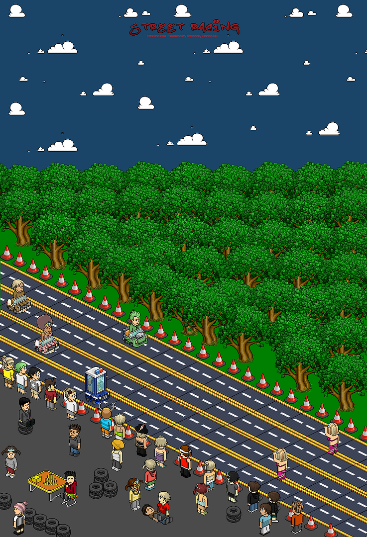
Its really good, as other people have said you should merge the roads to make it look less C&P-ish.. Also, I think you should change the colour of the pad of stickies on the table from Yellow to Pink.. As in pink slips, Ya' know?
Other than that, its quite clean
Last edited by Joshuarr; 13-04-2009 at 05:23 PM.
 > Selling Graphics, PM me for details <
-
I really want to change the roads as people are saying but its hard as there isnt enough room once the black line is removed to fit another purple square to merge them.
-
the heads turned to the side look a bit odd alex!
-
Sorry i dont like it. Sorry.

-
14-04-2009, 11:54 AM #17
good concept but:
-the road patches aren't aligned properly
-lotssssssss of c+p
-no shading on grass or pavement
-dull in the forest area
Love the way u like set it out though
-
lol, the place where the audience are is a bit random, wat is a man doing ontop of another man
 COME ON?!
-
You won

Could u post fulllllllllll? please.
-
Well i managed to do it ok, here i've uploaded it. I've only done 1 row just to show you its possible.
 Originally Posted by iTweedz

Jakeyeah?
Milkand2Sugars please.

 Reply With Quote


 Posting Permissions
- You may not post new threads
- You may not post replies
- You may not post attachments
- You may not edit your posts