

the middle part (the bit directly facing us) doesn't seem quite right to me, and i'm not sure why... it just doesn't look right. It might possibly not be isometric or aligned correctly. maybe somebody else will know why, as im not completely sure
Results 11 to 20 of 29
Thread: Computer desk
-


vouches
http://www.habboxforum.com/showpost.php?p=5481617
http://www.habboxforum.com/showpost.php?p=5480442
http://www.habboxforum.com/showpost.php?p=5506173
http://www.habboxforum.com/showpost.php?p=5525545
http://www.habboxforum.com/showpost.php?p=5771789
http://www.habboxforum.com/showpost.php?p=5795847
-
Nice, I like it. +REP
[SIGPIC][/SIGPIC]
-
I like the concept of it, I think you should make the desk a bit more thicker or realistic as it seems a bit thin. Also, I think it looks a bit odd the fact its on a diagonal, if it was more square it might look better?
If you have any queries or questions, just PM me!
:eusa_thin
-
Yes the middle part needs to be a darker shade, it is isometric, however it is one pixel to the right more than it is too the left, and there are several pixel errors with the top line as highlighted here:
 Originally Posted by Urnuph

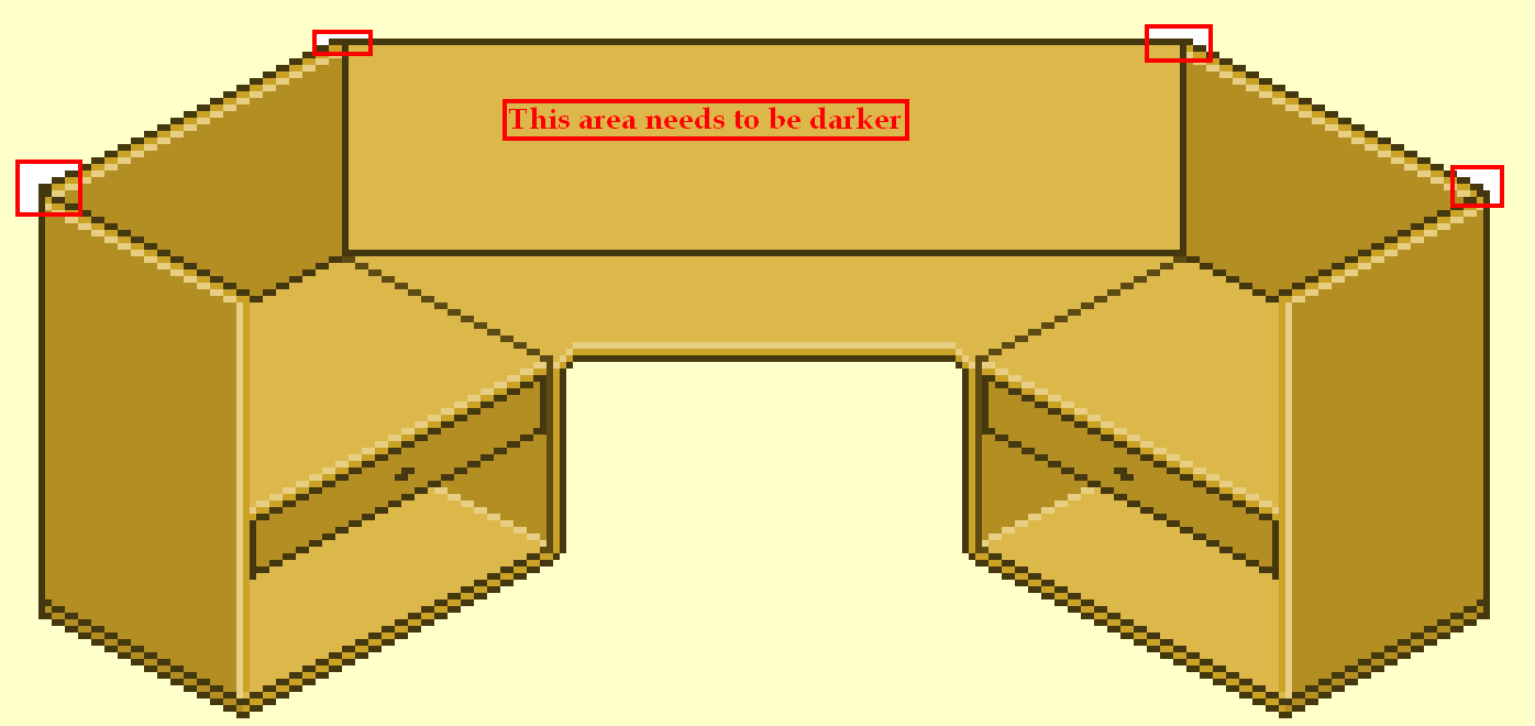
These are quite common mistakes but once one pixel is out of place in a line the rest doesn't usually come together accurately and thus you have a few, but I wouldn't worry about them. Sometimes they are easy to fix but if gone unnoticed they can be a real pain the backside, I know from experience :eusa_wall:eusa_wall:eusa_wall
As for the shading, I'm not sure what else to suggest, I did notice the left side is exactly the same shade as the right almost like a mirror goes down the middle, so idk maybe you could try some things that differentiate the sides :] The middle part looks ok with the same shade as the 2 sides that are next to it, I've tried.AKA: THE G R E G O R A H

-
Thanks for all the replys +rep returned and here is next version errors fixed and shaded a touch

Old:

Last edited by Casio; 06-05-2009 at 06:08 PM.
-
07-05-2009, 03:53 PM #16
-
this 1 looks better
-
Thanks and also what can be improved ? Originally Posted by lHuntey
What one looks better Originally Posted by benzinie
-
Looks good

-
Nice idea,
To finsish it, add pencils and a laptop to it
- i B r a d e r z
Be yourself, Dress Yourself In Youre Own unique way.
Dont copy, and don't look the same.
Cause we are humans, and we are different.


 Reply With Quote


 Posting Permissions
- You may not post new threads
- You may not post replies
- You may not post attachments
- You may not edit your posts