


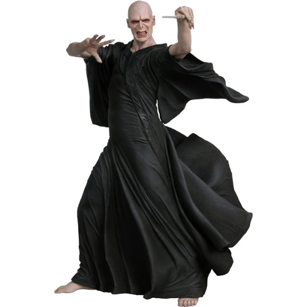
I mean, it looks like a failed attempt at shading but it just looks like different shades on black dots. Obviously it's better than I could do but I don't like the chest at all. It doesn't "flow".
Results 11 to 15 of 15
Thread: Voldemort
-
20-10-2010, 10:36 AM #11

-
Yeah, I didn't put much effort into the cloak at all.
 Originally Posted by Gibs960


-
This is really great, Fabienne!
I like that you only used two colors to shade the cape with - good job on that one ^^ The face doesn't really look like Voldemort because of the eyes and mouth I think.. but otherwise it's good.
oh hai!
-
Thanks! Well here's the original picture. Originally Posted by Tanna
-
omg very very nice... good job fellow aussie!!
 i don't see any issues with the feet but the right hand could use a little work

 Reply With Quote


 Posting Permissions
- You may not post new threads
- You may not post replies
- You may not post attachments
- You may not edit your posts