


That's horrid!
Results 21 to 30 of 63
Thread: New Navigator
-
24-07-2014, 05:24 PM #21

-
24-07-2014, 05:26 PM #22

Just seems to wide for me :S!
 Originally Posted by xxMATTGxx
 Last +REP from: Kardan
-
25-07-2014, 01:34 AM #23

Ugh I hate those quick links, so silly and WAY too big. Just keep the one we have it works great...
-
25-07-2014, 08:33 AM #24

Really not much of a fan. I prefer it how it is now. Anyway the current one is fine how it is IMO
-
01-08-2014, 11:03 AM #25

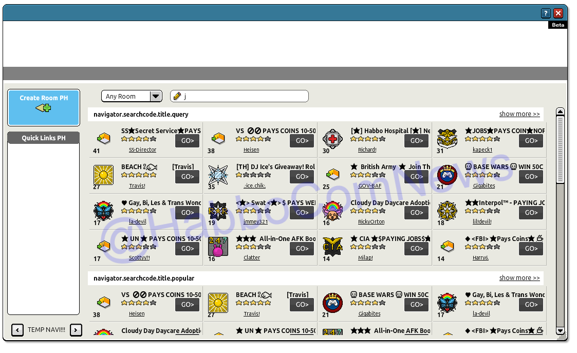
The navi is now resizable.Since habbo help tool is broken, here are the links:Help tool links
find your previous requests: https://help.habbo.com/requests
Submit new ticket (logged in): https://help.habbo.com/requests/new
Submit new ticket (not logged in): https://help.habbo.com/anonymous_requests/new
-
01-08-2014, 11:12 AM #26
who designed this?
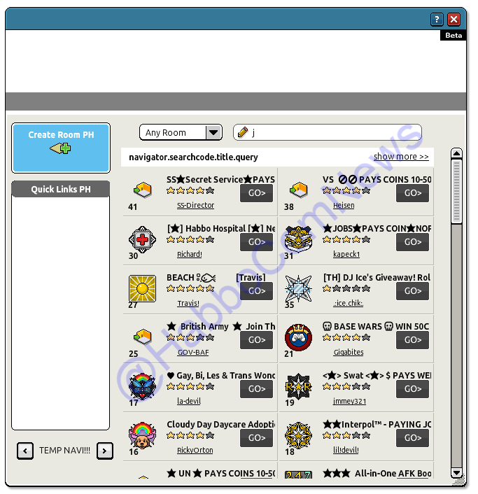
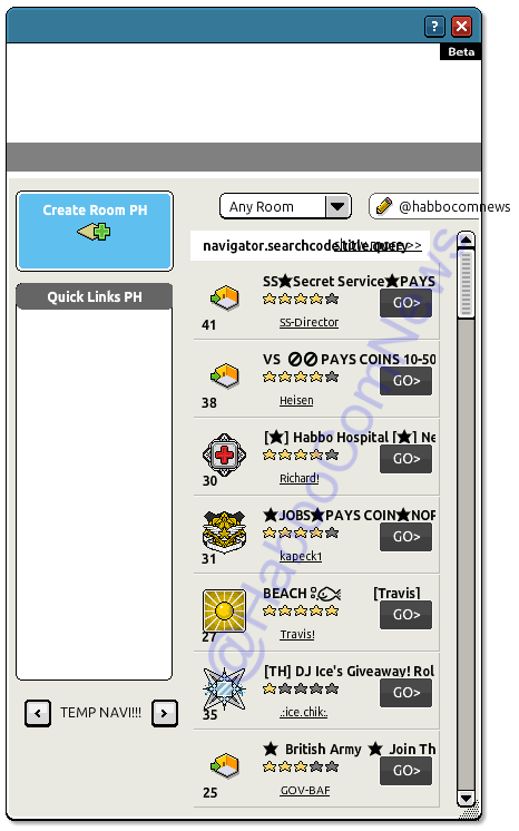
Currently we can see 21 rooms on the navigator without scrolling...there you can see 7
How can they not see that this is a downgrade?!
I will miss the way the sort popularity of rooms with colours too ;/
-
01-08-2014, 11:47 AM #27

- Join Date
- Jun 2007
- Posts
- 1,037
- Tokens
- 2,260
- Habbo
- MONEYMAGIC
I know, it's stupid! I know they'll do it anyway as they often do, but pleaseee don't! The one we have now is perfectly fine. Originally Posted by Red

-
01-08-2014, 12:18 PM #28
its disgusting, I even dislike the navigator we have now
-
someone tag staff and show them how not one person likes this pls (even though it won't do anything)
LEAVE IT AS IT IS. THIS IS A COMPLETE DOWNGRADE AND IS AWFUL!The day I get to 200 in Ping Pong II is the day my life is complete.
-
Looks like the ex-Creative Director of UX Design at Sulake has seen this thread, and is probably not impressed at his illumina being scrapped for this. If only Illumina could live on, just counting down the days now until the private messenger receives this UI
 :frust:

 Reply With Quote


 Posting Permissions
- You may not post new threads
- You may not post replies
- You may not post attachments
- You may not edit your posts