


Okay, so, I'm not a designer, but because It's my portfolio, I thought I should design it, even if it is "below par". This only took me a few hours, the About me section needs changing, I don't like it at all (plus that's obviously not me).
But yeah, anything I did well/could change?
Design
Oh yeah, I like space.


Results 1 to 10 of 10
Thread: [C+C] Portfolio Design
-
24-03-2015, 11:49 PM #1
 [C+C] Portfolio Design
-
25-03-2015, 11:21 AM #2

- Join Date
- Jun 2014
- Location
- Cornwall, UK
- Posts
- 733
- Tokens
- 2,340
- Habbo
- ItsMeerken
Look's good if i'm honest


Shannon - Courtney - Ryan - Aroonie - Tom - Britt
-
25-03-2015, 12:54 PM #3
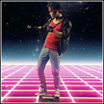
Nice picture! You look rather like @xxMATTGxx;
 hehe
hehe
Look's good Rhyss, maybe add some interaction?
 Originally Posted by xxMATTGxx
 Last +REP from: Kardan
-
it's HUGE, I know it's not coded but still, your workspace is huge!
I know the look you've gone for, but I don't think it's stayed consistent throughout it
I like the background though
drink up this bottle of yeah
and P A I N T your body on me
-
Not sure if you are even being serious since you have a picture that says it is you, but it is @xxMATTGxx; are you secretly a cat fish and the same person
 ?
?
Jokes aside, I think consistency is needed, for examples the arrows should either all be curved or straight then turn like a right angle, same with the colour. It looks OK, and as you said you are not really a designer so it is not too bad.
-
25-03-2015, 01:51 PM #6

I have to admit, I do look good as a placeholder.

Previous Habbox Roles
Co-Owner of Habbox | General Manager | Assistant General Manager (Staff) | Forum Manager | Super Moderator | Forum Moderator
-
26-03-2015, 08:39 PM #7

I really like the design! Everything needs to be scaled down though in my opinion. The text is much too large.
That's when Ron vanished, came back speaking Spanish
Lavish habits, two rings, twenty carats
-
I think it looks great, I really like the space theme.

-
26-03-2015, 09:57 PM #9
Aw thanks Originally Posted by !!Undead!!

We look nothing alike! I saw the texts Originally Posted by -Nick

I'll go through and make everything smaller and try to be more consistent with the fonts and colours etc Originally Posted by myke

Sorry, I thought I'd get away from being the Owner with this part time account, I created Rhyss as my "other me" to hide my secret life of a bad-ass. Originally Posted by Samanfa
Thanks for the feedback though, I'm coding it now so I'll go through and change those to be more consistent as I go!
Yeah, I didn't know what size my workspace needed to be, never done this before really Originally Posted by The Don
GO SPACE Originally Posted by Odd
Thanks
-
Looks good but like others have said the work space is too big haha. Obviously would be fixable though once coded

 Reply With Quote


 Posting Permissions
- You may not post new threads
- You may not post replies
- You may not post attachments
- You may not edit your posts