

what do you think I havnt done much but c+c plz and marks out of 10
Results 1 to 10 of 23
Thread: fineshed paint srt and habbo
-
 fineshed paint srt and habbo
own rep to :
fineshed paint srt and habbo
own rep to :
Cpt.Kewl
Reinout--D
If you leave rep leave you'r name

EVERYONE IM BACK I MISSED U (did u all miss me lol) ALL HOW R YA?????
-
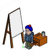
Errr... His hair's horrid, and the habbo in general is awful. BUT, I do like the canvas, but only the effect you did with the paper, and only before you... ahem... resized it. :S
Otherwise, it's okay. But don't use default paint colours, shade, and work on woodgrain...
-
The canvas and the er.. thing behind it is good.
The hair needs improved though.
Good - 8/10
-
Liam, I think you mean the eisle.
 I think it's ok, maybe you could practice shading like on the wood needs redoing and the hair. But it's a good attempt. 7/10 :] Oh and the draw has no thickness and is coming from nowhere.
-
 changed it a bit and its not hair its a berret i no its not that gd lol
own rep to :
changed it a bit and its not hair its a berret i no its not that gd lol
own rep to :
Cpt.Kewl
Reinout--D
If you leave rep leave you'r name
EVERYONE IM BACK I MISSED U (did u all miss me lol) ALL HOW R YA?????
-
I have numbered the things I am not pleased with.

1. It looks a bit fuzzy, I am not sure why, maybe you should make the lines a little shorter so it doesn't look fuzzy .
.
2. I can't put my finger on what is wrong with this hat. Maybe needs a bit more shading. I think it is the bobble though.
3. I think you shouldn't use the colours out of paint (default colours) for the pallet thing. I think you should mix them a bit. More shading aswell.
4. The paint brush is the same colour as the table and you still need to work on the table.
I like the canvas though Very good
8/10
P.s PLEASE don't do default colours as I said above. It makes it look worse. Change the colours of the bobble - please. I tried to change the default colours etc.

Last edited by PigsNose; 07-11-2006 at 10:05 PM.
Do you want Pie?
-
I think thats an exavior Rip.
Catzsy (Forum Super Moderator) - Please do not accuse members of stealing without proof.Last edited by Catzsy; 09-11-2006 at 12:59 PM.
-
its not a rip i made it myself, and its a bit blury because i resized it and thnx for changing the colors pigsnose
own rep to :
Cpt.Kewl
Reinout--D
If you leave rep leave you'r name
EVERYONE IM BACK I MISSED U (did u all miss me lol) ALL HOW R YA?????
-
I don't like it, you resized the eisle, which makes it look bad.
The other stuff is good though, try remaking the eisle.
7/10Last edited by micky.blue.eyes; 08-11-2006 at 05:45 PM.
[CENTER]Time you enjoy wasting is not wasted time.
-
Oh..
Lmao. I just realised thats not hair

 Reply With Quote


 Posting Permissions
- You may not post new threads
- You may not post replies
- You may not post attachments
- You may not edit your posts