


this was a 10 min project where i start to get used to using photoshop again so its pretty poorbut please rate /10 and C+C are appreciated.

Results 1 to 10 of 15
Thread: Emo/punk :D
-
 Emo/punk :D
[COLOR]Removed by invincible (Forum Super Moderator) as it was oversize[/COLOR]
Emo/punk :D
[COLOR]Removed by invincible (Forum Super Moderator) as it was oversize[/COLOR]
-
07-01-2007, 04:59 PM #2
- Join Date
- Dec 2006
- Location
- A Local Shop for Local People
- Posts
- 131
- Tokens
- 0
-
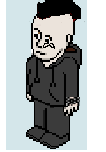
i made a new hair style gave it a braclette thing and made trousers more tigher like emo's
 Originally Posted by ElectricBanana
 plus enlarged it
[COLOR]Removed by invincible (Forum Super Moderator) as it was oversize[/COLOR]
plus enlarged it
[COLOR]Removed by invincible (Forum Super Moderator) as it was oversize[/COLOR]
-
if your looking for a rating.
3/10.
It sucks.
-
It doesn't look much different.
3/10we'll do what we've always doneshut our eyes and hope for the best.
-
*Text Removed* if your gonna not give Constructive critism please dont post seeing as that is what i asked for saying it sucks doesnt really cut it you have to suggest ways to improve it you stupid noobs
Edited by PriceTags (Forum Moderator): Please don't be rude.Last edited by PriceTags; 08-01-2007 at 06:34 PM.
[COLOR]Removed by invincible (Forum Super Moderator) as it was oversize[/COLOR]
-
Here I turned him into a REAL EMO T-T Originally Posted by 11:05
 Habbo Lover? Then your missing all the fun here at Habb Ok forum! We have up to date news, comps and bobba more! Join now! s1.zetaboardscom/Habb_ok_forum/index/ currently hiring staff
0 50 100 200 300 400 500 1000
-
BILLY do I have permission to use your big habbo? Originally Posted by BILLY
Habbo Lover? Then your missing all the fun here at Habb Ok forum! We have up to date news, comps and bobba more! Join now! s1.zetaboardscom/Habb_ok_forum/index/ currently hiring staff
0 50 100 200 300 400 500 1000
-
Originally Posted by BILLY
Thats a bit harsh? I like the curved bit at the back of the hair Originally Posted by x-umby-x
i'll give 5/10
-
Okay here is cc:
1. The habbo is too big to fit in a room.
2. The lines are two pixels thick.
3. The bracelet looks like a copy and paste (sorry)
4. You have made the habbo outline thin in some places and thick in others.
5. I don't know what the thing is on the shoe.
So for this I rate 3/10 it isn't very good, sorry.Do you want Pie?

 Reply With Quote


 Posting Permissions
- You may not post new threads
- You may not post replies
- You may not post attachments
- You may not edit your posts