


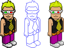
Ok, I have been bored Over the Holidays and have decided to come up with this Enlargement of Ken (.-.Extra.-.) Hope you like it Ken
Things i dont like- Belt
Things i like- Tie, Top And Hair
Please Comment Back, + C+P
Results 1 to 10 of 15
-
 .-.Extra.-.'s Enlargement! [Thorn]
-

I like it, but the tie makes my eyes go blurry, shouldnt the lines be thicker and less of them ? instead of thin and tonnes of them
-
Oh well.. Lol It gets the ppoint across that it's a stripy tie
 Originally Posted by lNaughtynemo

-
18-02-2009, 09:20 PM #4

- Join Date
- Aug 2005
- Location
- Standing on the rooftops...
- Posts
- 1,501
- Tokens
- 6
- Habbo
- ReviewDude
It's nice, but the 'whisp' of hair at the top-left looks a little too thin... It looked like a pixel error to me initially
 The sunlight hurts my eyes...
~ Love, Patrick ~
Know your stuff about Habbo? I'm looking for high-quality article writers - PM for more!
I am Habbox's most trusted seller of VIP/Donator - over 100 months total sold without issue.
-
18-02-2009, 09:43 PM #5
 LMAO STALKER Originally Posted by thorn
look ok shading looks a bit weird at someplaces 
but lol its me so notting can go wrong there :8
NEW HABBO NAME ADD EXTRAKEN !
also known as .-.eXtra.-.
FOLLOW ME ON TWITTER - Extraken_Habbo
-
Looks good, well done.
-
Looks good well done
Love making habbo alts (although im not that good)
-
19-02-2009, 07:57 AM #8
I agree with these points, except the last one, jokes. Also I agree with someone above, the tie does make your eyes go blurry a bit, just thicker and a smaller quantity would do the trick. And I know it crosses the point that it is a tie, it seems that you don't actually care, even though you do! Originally Posted by .-.eXtra.-.
-
19-02-2009, 08:41 AM #9

Shading needs alot of work in places especially the tie.
The tie looks like it's not isometric and isn't supposed to be on there.
The hair is ok, but lacks detail
Try an iso head because they can be harder
Also, the right shoulder ('his left') the vest goes into one line, You could pf edited that yourself by making it look like the other shoulder.
Nice job!
-
its nice, but needs alot of work if you want it to become elite.
set yourself some targets. E.g
> Smoothen The Curves,
> Fix The bits you dont like
> Sort out the hair
Across the pond, they all know us
International Whoaaa!
© 2008-2009


 Reply With Quote


 Posting Permissions
- You may not post new threads
- You may not post replies
- You may not post attachments
- You may not edit your posts