

:/ And what relatively even looks like Blader boys?
Results 11 to 20 of 29
Thread: My furni range, updated
-

-
I think it could do with some more shading. I like the paint but the furniture is a little bright.
 [CENTER]Time you enjoy wasting is not wasted time.
-
All honestly, i quite like it like that... But i will take it into consideration & get it done again soon

-
I, personaly, don't like it. It's just too... square?
+ rep for hard work
-
Lone didn't even go on habbox when he made the original (Did you Lone?) Anyway should be ELITES!
-
Very basic shapes, black lines inside the objects, quite sickening colours and little or no shading. Keep working on them though and try and make the shapes a little more interesting to look at.
You should try some pixel tutorials: www.zoggles.co.uk
4/10
-
Im not too sure about the colour but maybe thats just me.
-
9/10 how do u get in the room lol
 Originally Posted by lone_wolf
-
I like it +rep
70/70 attack !!ACCOUNT SWITCH GRAIL --> ARTH
-
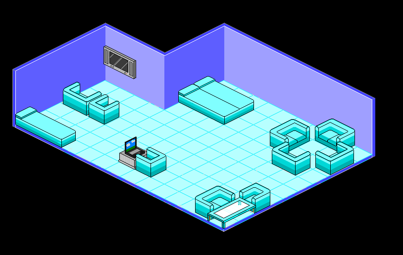
Hm, how do i explain this. But delete the black lines around the furniture and add a dark colour, if you get what i mean. Still 9/10
Like i posted before.
It's also lones, it's NOT recolour of Blader's there completely different.Last edited by heartQUIVER; 13-04-2006 at 05:21 PM.

 Reply With Quote


 taken into some CC, make it blue & have a black outline.
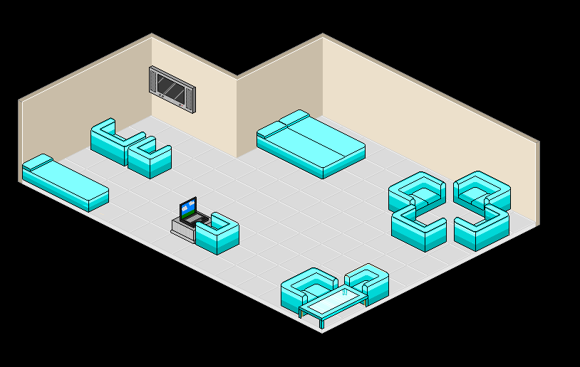
 Posting Permissions
- You may not post new threads
- You may not post replies
- You may not post attachments
- You may not edit your posts