

outa ten?
Results 1 to 9 of 9
-
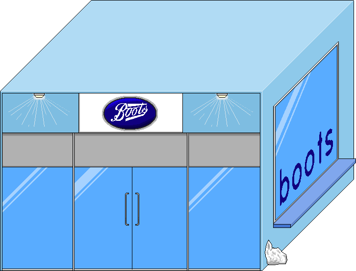
 My entry for Shopping comp [first proper alt] ?/10 plz
-
It dont look that isometric in front its just wierd. and that snow looks like it was just pasted in.
6/10
-
7/10 Good job.
Suggestions:
The lights' beam looks funny and the banner should be changed (it looks resized).
The glass window and door looks Fab but maybe put some shoes on display ?Last edited by -sweetyjo-; 03-06-2006 at 02:52 AM.
 ---------------------------------
-
nice!

Last edited by Uber-Jason; 03-06-2006 at 10:03 AM.

-
nice work, the windows look good but the boots logo looks resized 7/10
-
I dont like it, its not habboish and very isometric 6/10 But the boots thing's kl


-
I agree with Dave.
and change the shopping bag.
6/10
-
It's not in the isometric view Habbo uses (to avoid arguements about the meaning of isometric). The front is 2d whereas the rest tries to be Iso.
The boots sign look like something you got off google and filled in.
It's far too big to be even considered for Habbo.
The window tints are at different angles and are incosistant with the light source.
There appears to be no light source.
The light rays from the lights need to be alot more subtle.
It's just, bad. 2/10
-
It's very ismoetric? Wouldn't that be a good thing.
 Originally Posted by Xzoid
Unlike Xzoid said, it's not isometric. I suggest you google isometric pixel art tutorials.

 Reply With Quote


 Posting Permissions
- You may not post new threads
- You may not post replies
- You may not post attachments
- You may not edit your posts