

Hey, This Is My Medieval Set, Hope You Like It! It Is w.i.p So They Is More To Be Added!
Please Can YOu Rate Outa /10 and give c+c thank you much.

Results 1 to 10 of 12
Thread: Medieval Set (w.i.p)
-
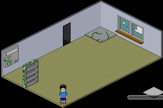
 Medieval Set (w.i.p)
-

to be honest i dont like it, it just looks like steel give it more of a gravel stoney earthy look
-
26-08-2006, 02:35 PM #3

- Join Date
- Oct 2005
- Location
- UK
- Posts
- 11,266
- Tokens
- 8,688
- Habbo
- The-Quiet-One
The 4 grey squares look like they were took from the Urban furniture one, & you just drew lines on it. Sorry if they aren't, just saying thats all.
But, its pretty good, maybe dull the green colours a bit, as they seem to bright, and add shading (or more if you have shaded)Last edited by Charlie; 26-08-2006 at 02:35 PM.
-
The vines are refloodippedid. They dont bend round to the left side and hit the wall to come out of, and theres no shading on anything. 3/10


-
-
Oh Well, Im Not Concentrating Enough Recently! Some Of You Guys Can Add/Alter Things Into/Onto It!
-
26-08-2006, 02:55 PM #7
- Join Date
- Jul 2006
- Location
- Manchester
- Posts
- 250
- Tokens
- 0
- Habbo
- ..::FREWIN::..
Good start, only 2-3 things i can complain about realy:
1:The Squares need to be made 3d, add a side to them to raise them from the normal floor.
2:Bookcase shelfs are deeper than the actual bookcase, most people do that wrong.
3:Maybe dull the vines and carry them on round the side.
As people said, shading, but that can be done later, the main shape of the furni needs to be done before shading.
so far: 6/10
fix the errors and i'd say: 7½/10
Here it is with the edited stuff:
Last edited by FREWIN; 26-08-2006 at 03:08 PM. Reason: Edited something.

Cannot believe you made me cut 10px from the bottom of my sig.
-
Two Words
Crap soz >;[
-
Mr v0dor = QUEER
-
Hmm. The bookcase looks slightly too thin to be stone, & make the tiles more interesting...
There arent any cracks on the inside of the bookshelf... which there should be concidering there are some on the outside.
And Im not very fond of the fluorescent green cracks... Hmm.
On the other hand, I like the Idea.:blue_sad [R.I.P Steve Irwin R.I.P] If you'd like a Sig or Avatar, PM me

 Reply With Quote


 Posting Permissions
- You may not post new threads
- You may not post replies
- You may not post attachments
- You may not edit your posts