


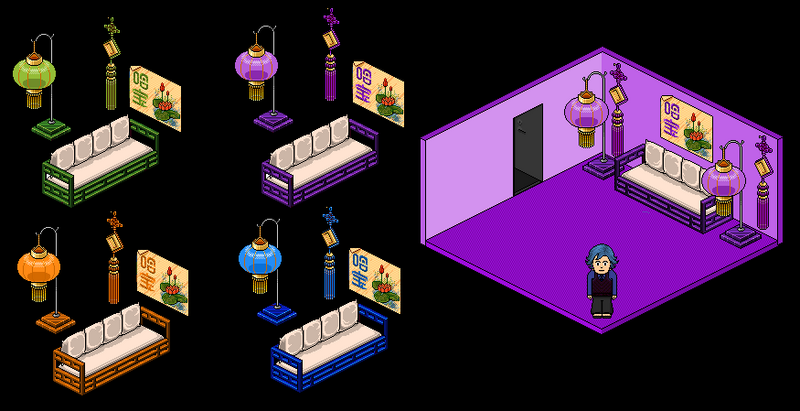
After my success with the lanterns...I bring you some more
As usual, Rate or Slate and please give any constructive critisism (but not about the black background, cus I know that that ruins it)
Results 1 to 10 of 13
Thread: Chinese Furniture
-
 Chinese Furniture
Last edited by Sammeth.; 12-11-2006 at 09:09 PM.
 Sammeth.
-
Amazing, but easily done. Move on to alts..
Also nice colour schemes. 7/10
-
The Blue Sofa is a bit bright, but apart from that well done
9/10Thanks, Sir-Cameron!
-
Nice
 Like the green lamp, orange sofa and purple knot

We're gonna ride the racecars,We're gonna dance on fire,With the girls Le DiskoSupersonic overdrive
-
8/10
i like the purple room
the orange doesn't really work. well done ;]
-
They are very nice.
I like the green and orange set but there is one bad thing, you have left the dark red lines that go along the lantern.
Also, try presenting your alts either on a transparrent background or just a plain white. They look betetr that way.
8/10.
-
 Ty for all your comments
And in my first post I did say that I knew the Black Background made it look awful But i usually do present them on White background. Just a one off
Sammeth.
-
Great work. I like the green and blue versions best. Very well done, they look brill. 9/10 +rep

-
Thanks very much for your comments (and I can tell you the rep was received warmly
)
Thanks for all your opinions x)Sammeth.
-
wow
There really good! Well done
I really like the purple room!
9/10 +rep

 Reply With Quote


 Posting Permissions
- You may not post new threads
- You may not post replies
- You may not post attachments
- You may not edit your posts