

Hey Everyone,
Im going to be doing a re-design of my website shortly and I am starting off by making myself a new logo. The site is called QuickScriptz Design and you can see it here; http://quickscriptz.ca.
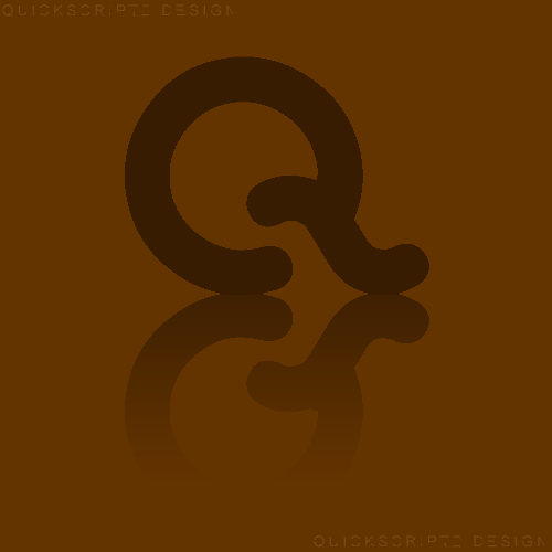
Logo Idea:
Please leave your thoughts and suggestions to make it better!
Thanks!
View Poll Results: What do you think of my logo idea?
- Voters
- 13. You may not vote on this poll
-
I love it!
6 46.15% -
It's okay...
6 46.15% -
It doesn't fit the site/company.
0 0% -
Its ugly.
1 7.69%
Results 1 to 10 of 17
Thread: Logo Idea [QuickScriptz Design]
-
 Logo Idea [QuickScriptz Design]
-
15-09-2007, 11:39 PM #2

I love the simplicity and the curvy nature of it
 Well done and good luck!
-
-
-
Thanks for the feedback Sygon. For a minute there I thought you were being sarcastic when I first read it - I missed the "s" and thought you just said it needs to be bigger

Anyways +Rep for feedback!
-
I like that looks very professionally made.
-
Really nice, I agree with Sygon about the s
.:; Johno
-
wow nice, simple yet effective, why not try it 3d? with the S going through the q
REMOVED
Edited by jesus (Forum Super Moderator): Please do not have text in your signature which is over size 4.
-
Thanks everyone, I shall take that into consideration. I might try another version of the logo later today - once I do I'll probably post it here again for more advice!
Thanks again! +Rep where possible!
EDIT: Just read gamemasters comment and I might try that. Thanks
-

 Reply With Quote


 Posting Permissions
- You may not post new threads
- You may not post replies
- You may not post attachments
- You may not edit your posts