


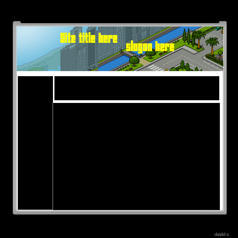
Ok so yeh i decide to have another go and this aint much better as it still needs alot done to it But i think its much better then the other layouts i have made. Hope you like it and rate/slate please. Any ideas of improveing then post
Results 1 to 6 of 6
Thread: Layout design Version 1 (:
-
 Layout design Version 1 (:
Im a runescape player.
Layout design Version 1 (:
Im a runescape player.

-
*pukes* nuff said.
Sorry theres too much to change in their, just change everything.How could this hapen to meeeeeeeeeeeeeee? lol.
lol.
-
Thats very constructive.. look at your designs =\
 Originally Posted by Reconix

Okay, one thing I don't like is the black background, throw it on a white background to make it easier to work with.
The content box isn't aligned right, it goes over the | border.
The bottom right corner just ends, and doesn't follow all the way up
-
Sorry, but this doesn't look good. And if it is for habbo, it doesn't look good at all.
Last edited by Meti; 08-03-2008 at 06:20 PM.
-
-
Looks good..honestly, just remove the black and align it

 Reply With Quote


 Posting Permissions
- You may not post new threads
- You may not post replies
- You may not post attachments
- You may not edit your posts