


I am really impressed with this!!
I just need to find someone who will code it for Joomla for me for freeeeeeee
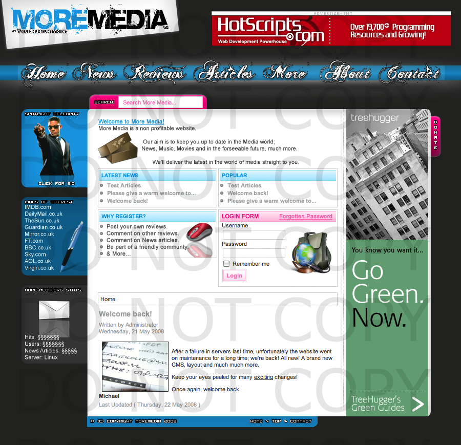
http://i147.photobucket.com/albums/r...ermarkcopy.png
Thanks
C+C?
Results 1 to 10 of 14
Thread: New Layout [Non-Coded] C+C?
-
 New Layout [Non-Coded] C+C?
drink up this bottle of yeah
and P A I N T your body on me
-
27-05-2008, 06:01 PM #2
I like the Title bit, but I think the navigation could be better. The pink really stands out from the other colours, its one of the first thing I notice and I don't particularly like it.
Where you have the spotlight celebrity, the bottom bit should be a different colour I think.
The smooth on the fonts won't be like that when you code it. The pixel font, is alright in places, but the spacing of the corner is too close to the pixel - The borders on the text should match the background of the container.
I did say the pink was bad, but on the login box, It looks alright.
6/10.Last edited by Protege; 27-05-2008 at 06:05 PM.
Hi, names James. I am a web developer.
-
- Nav bar font is bad
- Overall nav bar (like the background, etc) is bad
- The pixel font is bad
- The pink boxes and blue footer are bad colours/don't look good
- Don't use kerning on fonts
-
Ok Simon, how can I make the colours etc or w.e better?
& Thanks James, although I don't understand what you mean about the spotlight
drink up this bottle of yeah
and P A I N T your body on me
-
27-05-2008, 06:14 PM #5
there's a box underneath the spotlight celebrity - Its basically the same colour and doesn't look good, switch the colours with the stats and that box and it will probably look better.
Hi, names James. I am a web developer.
-
Ahh, another thing; any ideas on fonts that could be used?
drink up this bottle of yeah
and P A I N T your body on me
-
27-05-2008, 06:50 PM #7
Use a easy to read font for the navigation, headers - If its hard to read like your navigation font, I'd press "Back" straight away.
Hi, names James. I am a web developer.
-
The layout looks unfinished, spend more time on it. You might wanna add a few effects to the white box behide the logo, and the three boxs on the left could do with some, finally as other people said the font you've used for the navigation isn't the best choice.
-
every single box on there has effects :S
Ok, Nav font will change soon
Thanks all!
Took me around two days with like hour breaks but meh. lolzatmethenoob. x]
drink up this bottle of yeah
and P A I N T your body on me
-
Sorry..
 Originally Posted by SyrupyMonkey

Originally Posted by redtom


 Reply With Quote


 Posting Permissions
- You may not post new threads
- You may not post replies
- You may not post attachments
- You may not edit your posts