


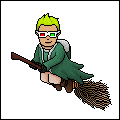
Completed Alterations of Joker and Ironman.

Results 1 to 10 of 19
Thread: Iron Man and Joker
-
 Iron Man and Joker

-
22-07-2008, 04:33 PM #2
- Join Date
- Nov 2007
- Location
- Liverpool
- Posts
- 2,810
- Tokens
- 6,894
- Habbo
- Marriott0.02
There quite good

-
22-07-2008, 04:48 PM #3
Lovely
was planning on making the joker myself to :p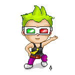
NEW HABBO NAME ADD EXTRAKEN !
also known as .-.eXtra.-.
FOLLOW ME ON TWITTER - Extraken_Habbo
-
22-07-2008, 04:51 PM #4
- Join Date
- Nov 2007
- Location
- Liverpool
- Posts
- 2,810
- Tokens
- 6,894
- Habbo
- Marriott0.02
Ken's a joker, but anyway looking forward to seeing your others

-
bloody amazing

Last edited by Spiffing; 22-07-2008 at 05:16 PM.

-
I love the ironman, its awesome.
-
The Joker one didnt impress me as much. I mean theres nothing wrong with the way it was drawn but how it was drawn. I hate the 'head on' view and although the head is turned it looks like you made him face forwards for ease. And the background seems really bright compared to the Joker's dark nature and the dark nature of the Batman film. If you had the shade on the Joker's side of the corner I would've prefered it as it shows hes hiding in the shadows compared to the bright colour of the wall.
But then again, that could just be me.
10/10 for Ironman (loving the attention to detail with the slight glow round him).
9/10 for Joker (like I said, pixel-perfect but I'm not so keen, sorry).
Edit: Oh, also your one of the few people who position their alts in poses, and I'm disappointed in the Joker's pose, sorry.Last edited by Browney; 22-07-2008 at 05:40 PM.
-
Nice work!
Once again you succeed in impressing me. Iron Man is the best of the two, there's something about The Joker that just doesn't appeal to me.
-
22-07-2008, 06:36 PM #9

- Join Date
- Mar 2005
- Location
- near manchester
- Posts
- 1,775
- Tokens
- 2,486
- Habbo
- mr.parasols
The environment and angle of the Joker really doesn't justify your talent, 'Ironman' has been drawn perfectly, but I think there needs to be more going on in the environment. Really nice line art though


-
I really did phone in the background, I am already working on a redux for it.
 Originally Posted by Browney

As for the positioning.. I stand by it. If I was truly looking for ease, the whole thing would have been done in front. But, an arms spread Joker pose made him ore inviting, which is part of his appeal as a character. He is a clown, and as such should be accessible.. but the knife is decidedly hostile.
Two-Face is going to be in nearly the same pose.


 Reply With Quote


 Posting Permissions
- You may not post new threads
- You may not post replies
- You may not post attachments
- You may not edit your posts