

I've never been that good at designing layouts ect, I can code them fine, but never get them right when im drawing them. Anyway, I just wanted some thoughts on the layout and some ideas on how it can be improved
Results 1 to 10 of 13
Thread: Entertain-me - Layout
-
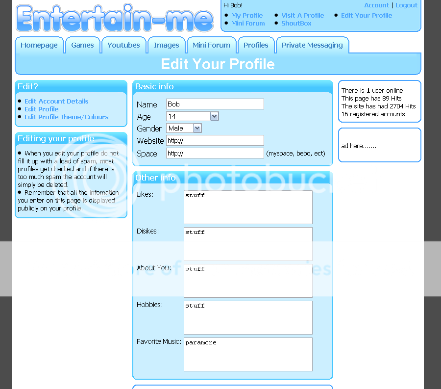
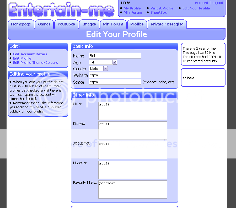
 Entertain-me - Layout
Signature Removed by Jamesy (Forum Super Moderator): Referal
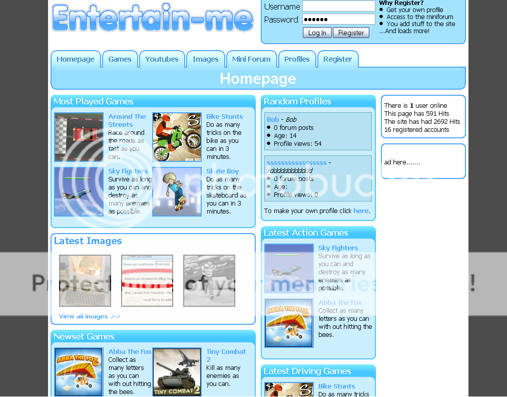
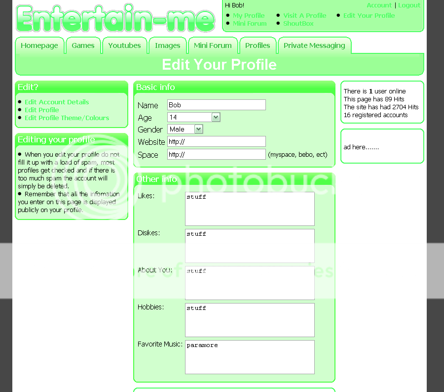
Entertain-me - Layout
Signature Removed by Jamesy (Forum Super Moderator): Referal
-
I like it, but add an image on the bit on the homepage on the user profiles. So it can be Profile Images or something.
Great though, keep it up.
-
Thanks for your feedback
 Originally Posted by RyanDOT

 I might add something that when ive got the site open, but that may use alot of space and bandwidth.
Signature Removed by Jamesy (Forum Super Moderator): Referal
I might add something that when ive got the site open, but that may use alot of space and bandwidth.
Signature Removed by Jamesy (Forum Super Moderator): Referal
-
-
What other colour schemes would you like to see? and I will be buying some hosting soon, im not using x10 Originally Posted by Pazza
Signature Removed by Jamesy (Forum Super Moderator): Referal
-
-
Looking allright. But it's too blue- Try adding some other colours on navigations etc.
-
I like it.
There's only two problems I have with it:
There's too much blue. Maybe add some more colours too it, or a colour changer (like mentioned somewhere above) would be good.
The navigation buttons aren't smooth. They have thjat 'pixel-y' feeling. Use the rounded rectangle tool, that will look better.
-
I think the banner is ugly and you should add more colour / stray away from the skype blue.
Try and be more unique but overall; Not that bad =]"RETIRED" FROM HABBO(X)
:¬:
TOMSPIT / COWLY05
-
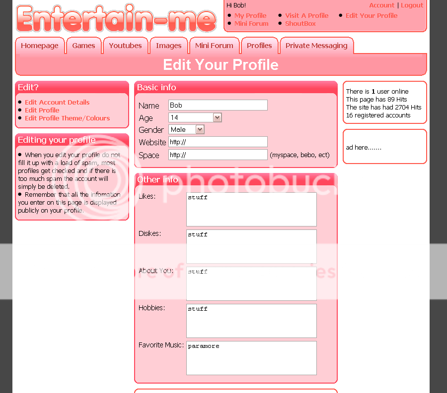
Ok, I have changed the colours using a paint program, I know the green and red are way too light, but i could make them darker becuase the white would have turned grey in the images. Originally Posted by Pazza
If i did split the images for the site i would redo them becuase the ones in the spoloiler look horrible.
I am gonna try that in a min Originally Posted by Meti
Im doing the navigation now Originally Posted by BOX!
Its looking a lot better. Thanks for the tip.
I might design a new banner becuase the one on the layout at the moment has too much detail on. Originally Posted by TomSpit
Thanks for the comments everyone
Signature Removed by Jamesy (Forum Super Moderator): Referal

 Reply With Quote


 Posting Permissions
- You may not post new threads
- You may not post replies
- You may not post attachments
- You may not edit your posts