


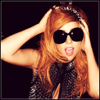
With light effect;
Without light effect;
both have lens flare.
Results 1 to 8 of 8
Thread: My shinehabbo banner :)
-
 My shinehabbo banner :)

-
looks good, wat does it mean?
-
24-12-2008, 06:34 PM #3
-
the shadows on the first one should have a higher opacity.
also tone the lens flare down a bit.(゚Д゚≡゚Д゚)
Roy: [singing] We don't need no education.
Moss: Yes you do; you've just used a double negative
-
I love the bottom one so so much you can't hardly see the ' s ' on the first one so you know...
-
Very nice, i love the first one but the 's' is weird also.
-
I like it but im not to keen on that font for the banner.
-
mean't to look like a stage prop
 Originally Posted by ST0RM-TR00PER

 .
.


 Reply With Quote


 Posting Permissions
- You may not post new threads
- You may not post replies
- You may not post attachments
- You may not edit your posts