

I think it was going OK until I added the text boxes in the middle?
Results 1 to 5 of 5
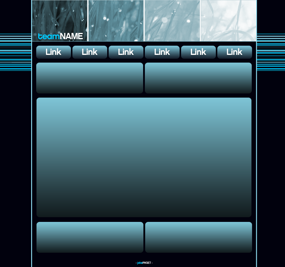
Thread: Blue Grass Template
-
 Blue Grass Template
Jakeyeah?
Milkand2Sugars please.
-
Yeh, that layout's not going to like gradients...
Chippiewill.

-
The layout has potential from the banner and background. The blocky navigation buttons and content boxes don't really compliment the layout either. The gradients are also a bit to strong.

-
The gradients are to heavy.
~ PixelPoco.com Co-Founder
~ Freelance Web developer.
~ Currently: Unavailable for work.
Lulz Originally Posted by Favourtism

-
the basic layout of it is good
Originally Posted by BoyBetterKnow
Originally Posted by BoyBetterKnow

 Reply With Quote


 Posting Permissions
- You may not post new threads
- You may not post replies
- You may not post attachments
- You may not edit your posts