

Here are some of My Simple AltsI hope you like them
Results 1 to 8 of 8
-
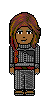
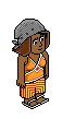
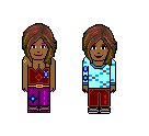
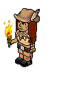
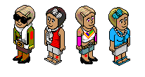
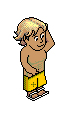
 [Dx] A few of my First Simple alts
Im A Graphics noob [] And Im Proud Of IT
[Dx] A few of my First Simple alts
Im A Graphics noob [] And Im Proud Of IT
-
24-10-2009, 09:09 AM #2
- Join Date
- Oct 2008
- Posts
- 331
- Tokens
- 0
- Habbo
- rifleboyaka
Very simple alts. Try to stay with one colour for one part of clothing
6/10
-
To be very honest i dont like them much looking at them sorry.
-
Well.. most of them, I have to say, have been poorly done. They have very bright and contrasting colours and you could have done better shading atleast.
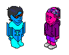
The first one is alright.. The hair is good, but the shading on the "I" needs to be angled.
I'm sorry, but I don't like them.
-
It's nice to see that you have quite a lot of ideas for clothing
 . The shading on some of them is quite poor and some have none at all. The shapes of some are a little off in comparison to the habbo and some don't follow isometrics. They're quite good for firsts, but there is room for improvement. I would suggest going through each one and try to correct some of the problems with shading and isometrics.

-
Typo
 Originally Posted by Fabienne

Sorry, let me rephrase.
The first one is alright.. The hair is good. But the shading on the "I" person has no shading and the "I" needs to be angled.
-
i am aware that most of the shadings are bad, but thats beause they were saved as .GIF and i did them way back when i was un aware of what PNG. And GIF. ment
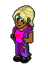
and as i did shadings on them the shading colours and the clothes colours mixed and formed that sort of double colourd effect. I will be extra carefull to save my work as PNG. From now on but if u see my second alt ( Tulisa From n-Dubz] I think i did a bit more of an effort on that one. And thanks for your comments Without them i would of continued with my messy alts.
Oh and ur right on the "I" person thats not to do with the formats :]Last edited by Detox,; 26-10-2009 at 10:54 AM. Reason: spelling mistakes and to correct my mistakes
Im A Graphics noob [] And Im Proud Of IT
-
tbh i don' like any of them, no good shading, and defo the I man needs work!


 Reply With Quote


 Posting Permissions
- You may not post new threads
- You may not post replies
- You may not post attachments
- You may not edit your posts